

Energy Musings - November 9, 2021

Energy Musings contains articles and analyses dealing with important issues and developments within the energy industry, including historical perspective, with potentially significant implications for executives planning their companies’ future. While published every two weeks, events and travel may alter that schedule. I welcome your comments and observations. Allen Brooks
Are We Losing Our Minds, Or Just Gaining Common Sense?
We are entering the final days of COP26, as 20,000 delegates struggle to craft a package of climate change policies that every country can embrace. In contrast to prior conferences, the politicians came first and are now gone, leaving the heavy work to others. Good luck.
Is Russia Taking Gas From Germany, Or Is It Disinformation?
The last weekend of October, natural gas in the Yamel-Europe pipeline started flowing in reverse from Germany to Poland. Coupled with reports of Russian troop movements near Ukraine, the media suggested Russian President Putin was reneging on his pledge to get more gas to Europe
What Does This Spoof Say Of Climate Activists’ Intelligence?
We’ve never heard of “stolen satire,” but a map of the U.S. with the Mediterranean Sea superimposed on it led to claims it showed the future of the country in 30 years unless something was done about global warming. Thousands of viewers bought into this spoof. Gullible?
Is The Green New Deal Ready For Primetime?
Fully autonomous vehicles being tested are stumped by San Francisco’s “Slow Streets,” so they keep making U-turns. In Europe, an offshore maintenance vessel dropped a wind turbine’s blades and rotor overboard, while reports of turbine foundation cracks, fires, and collapses grow.
Are We Losing Our Minds, Or Just Gaining Common Sense?
The 26th U.N. Climate Change Conference of the Parties (COP26), the two-week talkathon of 20,000 delegates from around the world, is moving into its final days. Just how much about regulating our climate will be achieved remains to be seen. Although we have seen reports of agreements on regulating methane emissions, deforestation, climate change financing, and not building new coal plants, we really will not know the full scope of what was decided until the final hours when the official conference statement is issued. Whether that statement reflects tangible progress in curbing carbon emissions or merely restates climate regulation platitudes, is unknown. The fact that many of the agreements have not have 100% support suggests COP26 will not be viewed as an overwhelming success.
We cannot imagine the final statement lacking a breathtaking declaration about the monumental achievements of the delegates, as they pack their bags to leave. But will there be substance to such a declaration? Will the heads of the delegations of the nearly 200 nations participating in COP26 agree to measurable actions, or merely pledge to achieve carbon reduction targets sufficiently far in the future they can never be held accountable? While China led the parade of a longer runway to net zero carbon emissions at the 2015 Paris meeting, India has said it will achieve the target by 2070!
Heading into COP26 there was an intense effort by United Nations’ officials, global energy agencies, a few key governments, and leading climate activist organizations to secure commitments from attending countries to meet the target of net zero carbon emissions by 2050. Not unexpectedly, intense pressure was applied to the leading emitters. As the following chart shows, the ten leading emitter countries account for roughly three-quarters of the world’s carbon pollution. The chart also shows for many of the leading emitter nations the relative carbon emissions contribution from agriculture and energy.

Exhibit 1. Global Carbon Emissions By Country And Source SOURCE: World Resource Institute
As we watched in late summer and early fall during the run-up to the conference, reports from various meetings of the leading countries negotiating the COP26 agenda suggested there was a lack of unanimity of purpose. The pressures brought by developed economies against developing economies over their use of fossil fuels became intense and produced pushback. India was a leader in pushing back against basing carbon reduction actions on a country’s total annual carbon emissions. India’s leaders expressed the view that the proper measure should be per-capita carbon emissions. Such a shift would acknowledge that those developing countries with very large populations that are rapidly industrializing and lifting their citizens’ living standards are being penalized when total emissions is the measure. Developed countries with smaller populations and existing high living standards were not being penalized as much because their reduction targets were smaller.

Exhibit 2. India’s Per Capita CO2 Emissions Are Growing Slower Than China’s SOURCE: Wikimedia
The chart above demonstrates why India is leading the charge to establish carbon emission targets based on per-capita volumes rather than total emissions. In the chart, each country’s color shows an estimate of its carbon emissions growth rate for 2018-2019. While India’s carbon emissions growth rate is considerably faster than that of the United States, it is below the rate of China. India’s total per-capita emissions are extremely low compared to the world’s two largest emitters. On an absolute carbon emissions basis, as shown in the earlier chart, India would rank third, behind the United States and China, if the countries comprising the European Union are disaggregated. Which measure will be the most impactful to regulate?
Another interesting perspective on carbon emissions is from an article by Carbon Brief showing the historical accumulation of carbon emissions from 1850 to 2021 for the world. The analysis divides the historical carbon emissions into those coming from fossil fuel and cement, compared to those from land use change and forestry. The chart below shows the world totals for these two categories.

Exhibit 3. Carbon Emissions By Source 1850-2021 SOURCE: Carbon Brief
The authors of the report make the point that carbon emissions from land use change and forestry have remained relatively constant over the last 170 years. In 1850, these emissions totaled around three gigatons of CO2 (3GTCO2). Today, emissions are estimated to be roughly 6GtCO2. Carbon Brief also pointed out that the spike in 1997 was a result of the forest fires in Indonesia and other parts of Asia.
According to the report, fossil fuel and cement emissions have doubled over the past 30 years, quadrupled over the last 60 years, and increased by nearly 12 times over the past century. The 0.2GtCO2 of emissions released in 1850 represents about 0.5% of the roughly 37GtCO2 estimated to be emitted in 2021. However, although most of carbon emissions today come from fossil fuels and cement, human activity from deforestation contributed significantly to the cumulative total. During 1850-2021, land use change and forestry added roughly 768GtCO2, or nearly one-third of the cumulative total of carbon emissions, while the remaining two-thirds (1,718GtCO2) came from fossil fuels and cement.

Exhibit 4. Countries Ranked By Cumulative Carbon Emissions 1850-2021
The 20 largest contributors to cumulative CO2 emissions 1850-2021, billions of tonnes, broken down into subtotals from fossil fuels and cement (grey) as well as land use and forestry (green). Source: Carbon Brief analysis of figures from the Global Carbon Project, CDIAC, Our World in Data, Carbon Monitor, Houghton and Nassikas (2017) and Hansis et al (2015). Chart by Carbon Brief using Highcharts.
SOURCE: Carbon Brief
The chart above shows the ranking of the 20 largest carbon emitters for 1850-2021 and their total volumes split between fossil fuels and cement versus land use change and forestry. In this ranking, India falls to seventh place. It is also noteworthy that about one-third of India’s cumulative carbon emissions are attributable to land use change and forestry. We find the ranking particularly intriguing given that in 2017 the International Energy Agency (IEA) listed India as the fourth largest emitter accounting for 7% of the world’s total carbon emissions while Indonesia ranked ninth accounting for 2% of the total. As the chart shows, Indonesia was ranked 5th with 80% of its emissions from land use change and forestry, compared to 7th place India.
The pressure on the governments of the largest emitters has been relentless for most of 2021.The pressure was ramped up in early August with the release of the Intergovernmental Panel on Climate Change (IPCC) Assessment Report 6 (AR6).The report is the latest data on the state of global climate science and the view of scientists about the health of the atmosphere, along with projections for its future in 2100.While AR6 continued the message of all prior climate assessment reports, this one’s conclusions were labeled “code red” by United Nations Secretary-General António Guterres. Interestingly, the report does not use this terminology, and many of its conclusions were not quite so stark. The policymaker summary report emphasized the fear of global warming by once again showing a computer-generated hockey-stick temperature projection. However, the likelihood of most of the disaster climate events associated with global warming was not high.
The report’s August release date coincided with several meaningful heat waves around the world, which reinforced the message being delivered that it’s hot and fossil fuels are the problem! AR6 provided the platform for a relentless drum beat of climate change articles highlighting how rapidly the climate was deteriorating due to the burning of fossil fuels and the resulting carbon emissions causing catastrophic climate disasters.
The question becomes how to judge the success or failure of COP26? Will the outcome present a realistic assessment of the climate situation and the development of plans that can be implemented within a reasonable time and at a realistic cost that may slow carbon emissions growth and even possibly lead to their eventual decline?
Starting with COP26’s goals, there is no shortage of issues the delegates should resolve, partly because there have been so many unresolved issues from previous COP conferences and interim strategy meetings leading up to this conference. Johan Rockstrom, director of the Potsdam Institute for Climate Impact Research, told a CNBC reporter in an interview two days before COP26 started that in his estimation the success of the conference will come down to the negotiations on five ‘make-or-break’ issues. His five issues are: mitigation, climate finance, carbon pricing, nature solutions, and the phasing out of fossil fuels. That is no small agenda.
According to another assessment, a key issue needing to be resolved relates to climate debt and the establishment of financial mechanisms to ensure that those most responsible for current disasters pay for the damages. While this topic might fall under climate finance, as cited by Rockstrom, this specific issue relates to the commitment of developed countries to provide developing countries with money to help them in their energy transition. That commitment was solidified during the Paris meeting in 2015, but it had originally been agreed to in concept in 2008. All 192 countries, including the E.U., signed off on the Paris Agreement and agreed that developed countries would provide $100 billion annually to help developing countries manage their energy transitions. The fund was to be in place and fully funded by 2020 and continue for five years. Presumably it would be renewed at the next COP meeting, which is this meeting although it was rescheduled from 2020. Not surprisingly, the coffers weren’t full when the developing countries looked in this year. Speculation is that the $100 billion funding level will not be met before 2023. Some developed countries are saying that they have met their commitment when foreign financial aid they are currently providing to developing countries is included. Regardless, as the following chart shows, the funding has fallen well short of the goal.

Exhibit 5. Developed Countries Haven’t Funded Commitment To Developing Countries SOURCE: BBC
What may have been missed by many people in the run up to COP26 was that the developing countries are now suggesting they need, or are entitled to, more financial help. According to South African Environment Minister Barbara Creecy, “Our suggestion is that post-2025, we must move from a floor of $100 billion.” She claimed that South Africa needed substantial funds if it is to transition from burning coal that makes it the 12th largest carbon emitter. She then said, “Taking the needs of developing nations into account, we must move toward a collective goal of mobilizing $750 billion a year.” She told her audience that she had made this recommendation at a July COP26 planning meeting in London. Since then, others have suggested the fund should be increased to $1 trillion a year. Last week, the total was upped to $1.3 trillion, and others have tossed out annual funding of $1-$2 trillion a year.
The problem is the financial world we are currently in. While discussing the $100 billion commitment, Rockstrom said, “In all honesty, this is really just small money.” He went on to note that the trillions of dollars in bailouts governments have been spending to recover from the Covid-19 pandemic suggests the world should be prepared to pay billions to facilitate the climate transition, which is arguably more important. Printing money has become an elixir for anything needed, regardless of any cost/benefit analysis.
In Rockstrom’s view, mitigation is tied to the plans of countries to reduce their carbon emissions. The U.N. issued a report the week before COP26 that found the new and updated Nationally Determined Contributions (NDC) of countries have the world on a track for an increase in global temperatures of at least 2.7º C (4.9º F) by 2100.However, that forecast is consistent with the most likely global warming scenario highlighted by IPCC AR6.The chart below is from a recent presentation by climate scientist Judith Curry showing possible climate outcomes based on carbon emissions and the sensitivity of the climate to these emissions.The projection citied in the U.N. report comports with the middle scenario (SSP2-4.5) in the chart below. That scenario is consistent with the present path of global warming based on current carbon emissions and greenhouse gas policies. In fact, the world is on track to perform better than that middle warming scenario, meaning a lower temperature increase. That being the case, then we should be both continuing our ongoing efforts to limit carbon emissions and working to protect people from the worst of the damage from climate change impacts.

Exhibit 6. Large Measure Of Uncertainty Governs Climate Scenario Projections SOURCE: Judith Curry
Carbon pricing is another key objective of climate activists. The theory is that if carbon has a price tag attached to it, people and businesses will work to avoid carbon-rich products that will cost more to lessen the financial impact on their budgets. Carbon pricing is also considered by many economists to be the most efficient mechanism for inflating the price of fossil fuel, making them less competitive versus renewable energy, and accelerating the energy transition. The reasoning of the economists is based on a specific structure of carbon taxes. They would be designed to raise money that would eventually be returned to the people in a manner that ensures low-income families receive more of the money, protecting them from the disproportionate portion of their budgets spent on energy. However, this tax has less public appeal because it is seen as a lucrative money-raiser that politicians will quickly embrace and redirect the funds. The public fears some or all the tax revenues collected will be directed to politicians’ pet projects rather than returned to the people as envisioned by economists.
The nature issue covers significant ground, ranging from dealing with the world’s current carbon budget and our natural carbon sinks but also how climate change interacts with biodiversity, as well as social justice issues. In Rockstrom’s opinion, there is no carbon budget remaining for the planet unless we secure the carbon sinks in nature – on land and in the oceans. For example, this would include protecting the Amazon, called the ‘lungs of the Earth’ for its ability to absorb substantially more carbon than it yields from agriculture, mining, and forestry.
The final challenge is likely the most contentious, which is the phasing out of fossil fuels. The burning of fossil fuels is understood to be the chief driver of climate change. Given the amount of warming already experienced and the additional warming projected, ending the burning of fossil fuels immediately is a necessary prescription for preventing a climate disaster. The problem, as Curry points out, is that we do not know the magnitude of projected climate impact of carbon emissions from fossil fuels relative to those emanating from nature. Just how sensitive is the climate to carbon emissions?
Curry went on to explain the significance of what scientists are now estimating for future global warming. The following chart with two graphs from her recent presentation highlight the issue. As seen in the left-hand graph of emissions scenarios from AR6 and the IEA’s World Energy Outlook (WEO), the most likely projections are well below the SSP5-8.5 climate disaster scenario highlighted in AR5 (the prior assessment report) as the ‘business as usual’ case. That climate scenario was judged by the IPCC as unlikely to occur because it assumed an economic growth outlook that required an outlandish amount of coal use that was virtually impossible to occur. Despite even the IPCC doubting the likelihood of this scenario, this forecast was seized up by the media as business as usual and it became the foundation for almost every climate disaster story for the past five years.
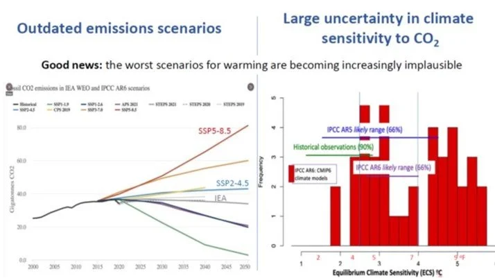
Exhibit 7. Worst Environmental Scenarios Are Minimized In IPCC AR6 SOURCE: Judith Curry
The right-hand graph in the chart above shows the climate sensitivities employed in the various climate models used in AR6. Note that the most likely range (66% probability of occurring) in AR6 is well below the same estimated probability utilized in AR5, and it falls below the 90% historical observations mark. What does this mean?

Exhibit 8. The Uncertainty Of Global Warming Magnitude And Continuation SOURCE: Judith Curry
The lower climate sensitives to carbon translates into a reduced Best Estimate projection for the global temperature increase by 2100. This is reflected in SSP2-4.5, which shows a 4.9º F temperature increase by 2100. That projection suggests we will see more warming over the next 80 years than has been experienced since 1850. As the unconstrained and constrained 90% ranges of temperature projections suggest, there could be temperature increases of more than a 4.5º C (9º F) or as little as 1.6º C (2.8º F) by 2100. However, some climate model projections (CMIP6 models) show the Best Estimate projection may prove to be too high. In the chart to the right, Curry lists some of the climate events that could limit the temperature rise or restrain the increase materially. Those possibilities are given little airtime in a world obsessed with global warming.
Dr. Roger Pielke, Jr., an expert in climate extreme events and disasters, recently delivered an ICSF/CLINTEL lecture in Dublin, Ireland, titled “What does IPCC AR6 say on Scenarios and Extreme Weather?” Like Curry, Pielke points out how the IPCC AR6 presented a more moderate view of our climate future but offers climate scenarios that feed the disaster narrative of climate activists and the media. He highlighted a table showing numerous climate events that are key to the disaster scenarios and the IPCC’s view of whether they are detected in the climate data and if that data supports the attribution that the disasters come from carbon emissions. The table lists 18 climate events associated with climate disasters we are told about almost daily. However, only five of the 18 events were detected in the data and the events could be attributed to climate change. But as Pielke noted, the detections and attributions for three of the remaining events were only deemed to be climate-related with ‘medium confidence,’ meaning the odds of the observations being correct were 5 out of 10, or a 50% probability – not particularly high. Of the remaining two events (heat waves and heavy participation), their existence and attribution were assessed with ‘high confidence.’ Despite the actual scientific qualifiers, a reader of climate science media would be hard pressed to understand that almost all these events associated with climate disasters are not considered likely.

Exhibit 9. IPCC Can’t Find Support For Climate Change Created Events SOURCE: Roger Pielke, Jr.
Although the IPCC AR6 contained better news than U.N. officials declared, its conclusions were brushed aside because they didn’t align with the climate change narrative. Thus, the focus on “code red.” Only the end of the fossil fuel era is considered acceptable by climate activists. That push, however, is running into the reality that the activists’ favored power sources – wind and solar – are proving incapable of keeping the lights on without timely support from fossil fuels. Having shut down or abandoned electricity generation powered by fossil fuels, the sudden demand for their output has put a premium on these fuels and caused oil, natural gas, and coal prices to soar. This supply/demand reality was what confronted the leaders of the G-20 nations when they convened in Rome just days ahead of the opening of COP26, and they could not reach a consensus as to the solution.
The leaders of four key countries critical to the climate change debate were absent from the G-20 gathering. Key leaders missing included China’s Xi Jinping and Russia’s Vladimir Putin. Also absent were the leaders of Japan, Mexico, and Saudi Arabia. Much was made of the absence of China and Russia, as they represent two of the leading carbon emitters. Neither country’s leader attended COP26, either. Those countries were represented by senior government officials, but without the official head of those governments, there were challenges for the G-20 to reach an agreement about climate change policies, although the group did reach an agreement with respect to a minimum 15% global corporate tax rate to be implemented in 2023.
While it was impossible for the G-20 to not reach an agreement on climate change, especially since most of the leaders were heading immediately to Glasgow for COP26, the final communique’s pledge was considerably watered down from the original version. The exhibit below shows how the language shifted in the respective drafts during the meeting.The language regarding banning the building of new coal-fired power plants, as in the original draft, moved to the banning happening in the 2030s, and finally to an endorsement of the actions of those countries who wish to institute such a ban. The language change suggests it was impossible for the leaders of countries rushing to transition from fossil fuels to renewable energy to convince those leaders who are more concerned with a reckless policy move that would inflict economic harm on their countries. While the climate media will proclaim those objecting to the transition are ignorant, these world leaders are demonstrating leadership for their countries, as they weigh the benefits against the economic risks of such a move. Prudence is a better description than ignorance, but not climbing on the climate change bandwagon is their greatest offense.

Exhibit 10. G-20 Communique Language Reflects Lack Of Climate Change Consensus SOURCE: The Austrailian
It is hard to conceive of the actions of Putin and Xi on climate and coal plants being viewed as common sense. Although in both cases, these leaders are making cost/benefit decisions. On the other hand, we were shocked a couple of weeks ago to read the comments by two leaders within the global financial world who have pushed ESG (environmental, societal, and governance) metrics for guiding investment suddenly warning against the outcome this push has produced.
The current energy crisis, marked by the spike in energy commodity prices, is creating significant angst. Suddenly the root cause of the energy crisis is being recognized: a lack of adequate investment. The throttling of new investment flows into the oil and gas sector has been caused by low commodity prices from 2015 through the disastrous early months of 2020. Additionally, the growing ESG-mentality and adherence to ill-defined ESG metrics have caused financial firms to redline investing in fossil fuel companies. The combined pressures have dried up of investment flows into the traditional energy sector just as demand for these fuels is exploding. Furthermore, a wide range of energy demand forecasts demonstrate that fossil fuels will be needed for decades to come despite the rapid growth of renewable energy investment. Where will that needed energy come from, and who will provide the necessary investment?

Exhibit 11. E&P Capital Spending Last Six Years About Half Of Prior Six Years SOURCE: Raymond James

Exhibit 12. E&P Reinvestment Rates Below 100% For Last Three Years SOURCE: Factset, Rystad, Raymond James Research
The two charts above show capital spending in the oil and gas industry since 2010 along with a calculation of the industry’s reinvestment rate. The latter measure tells us the willingness of oil and gas producers to put a portion of their cash flows back into their primary business – finding and producing more oil and gas. The lack of dollars being re-invested, coupled with forecasts for 2022 suggesting only a low single-digit increase in overall spending, is contributing to a tight supply/demand market balance and rising prices. Although current oil prices have fallen below $80 per barrel due to concerns over an economic downturn reducing energy demand, it is likely that higher oil prices would not have advanced in the ensuing six months. Winter always lowers oil demand, and at the same time, OPEC+ is continuing to add supply every month to the oil market. Furthermore, downward pressure on oil prices is being exerted by the overhang of the possible return to the market of Iranian output.
Longer-term, the under-investment in finding and developing new oil supplies will limit future output growth. Will this limited supply growth extend the tight oil market, or will demand erode sufficiently to loosen the market balance and reduce prices? It is difficult to answer that question now, but the odds appear to favor a continuation of a tight global oil and gas market sustaining or lifting current prices further down the road.
What current oil and gas market conditions have created is the hypocritical scenario of Biden begging Russia and OPEC to increase oil supplies, while his administrations’ policies hobble the domestic energy industry’s recovery and growth. Watching this hypocrisy in real time makes one wonder if Washington politicians can walk and chew gum at the same time?
Today, we view the oil and gas industry with a little more hope given the recent comments of Steve Schwarzman (Blackstone CEO) and Larry Fink (BlackRock CEO) about the role of ESG metrics in causing the current energy crisis. These two financiers were speakers at the Future Investment Initiative conference in Saudi Arabia in late October. Their views were discussed in a column by the DealBook column of The New York Times. The column was titled: “Why This Billionaire Is Worried About Green Investing.”
A focus on E.S.G. is driving a credit crunch for oil and gas companies, Schwarzman and others say. So-called environmental, social and corporate governance investing principles have spurred investment giants to divest their holdings in oil and gas companies. That, according to Schwarzman, has made it hard for the industry to invest in new wells and other sources of capacity. “If you try and raise money to drill holes, it’s almost impossible to get that money,” he said. (Blackstone has invested in both fossil-fuel and renewable energy companies.)
Schwarzman isn’t alone in his thinking. Even Larry Fink of BlackRock, who has been among the biggest advocates for Wall Street adopting E.S.G., is worried that outflows from the fossil-fuel industry may be overdone. “We have these visions we could go from a brown world and we could wake up tomorrow there’d be a green world,” he said at the F.I.I. conference. “That is not going to happen.”
Governments need to intervene, Schwarzman said, particularly to help manage the transition into greener energy. “There’s unanimity something should be done, but how you get from where we are today to a green world is utterly undefined,” Schwarzman said. Otherwise, political troubles await: “You’re going to get very unhappy people around the world, in the emerging markets in particular but in the developed world,” he added.
Confirmation of this trend of reduced money for traditional energy businesses and more money funding green energy investments is in the chart below. It shows annual flows and assets of sustainable (green energy) funds. These measures rose in 2019 and soared in 2020.

Exhibit 13. Both Sustainable Fund Flows And Assets Soared In 2020 SOURCE: Morningstar
While sustainable investment flows slowed during the second quarter of 2021, the first half of this year showed a dramatic rise over the same period in 2020. Unless flows in 3Q and 4Q fall off dramatically, 2021 should mark a third consecutive year of rising investment flows into sustainable funds.

Exhibit 14. Quarterly Sustainable Fund Flows Remain Strong In 1H2021 SOURCE: Morningstar
While COP26 will be declared a success, the reality is that the outcome from the preceding G-20 conference torpedoed it. By failing to tighten up and extract increased carbon emission targets from the leading emitting countries, the reality is that green energy remains a work in progress and will be unable to carry the burden of powering the world’s economies for the foreseeable future. As a result, periodic power blackouts disrupting people’s lives and countries’ economies are likely to be a recurring phenomenon of life in many countries, both developed and developing. Moreover, the rush to transition away from fossil fuels risks crippling the rise in living standards in developing economies, with the risk, as Schwarzman noted, of civil unrest. Hearing two of the most important financiers in the world acknowledging the risks that ESG investment guidelines are bringing to world economies and populations is sobering. It may also be an early sign that the climate change transition train is slowing, and its future trajectory less disruptive. These are signs that common sense may be gaining a more significant place in the energy transition debate.
As we were completing this article, Carbon Brief released a new study on carbon emissions showing that the total has been essentially flat for the past decade. The revision is partially explained by a new assessment of the data on carbon emissions from land use change and forestry. In Carbon Brief’s article on its web site, it had a series of interactive charts, but the snapshot below captures the revision in the data since 2000.

Exhibit 15. Carbon Emissions Count Revised Down And Was Flat For A Decade! SOURCE: Carbon Brief
This revised view was supported by a study from Al Gore’s organization climatetrace.org that has used satellite and ground measurements to track carbon emissions. Their study concluded that emissions were roughly 50 gigatons per year for the past five years. This total is higher than Carbon Brief’s estimate but reinforced the view that emissions appear to have stabilized in recent years. The issue of stabilizing carbon emissions needs further analysis, but it adds to the point made by Curry that there are questions about global warming due to uncertainty about carbon emissions. Are these new emissions studies further evidence that common sense may be starting to play a greater role in the climate change and energy transition discussion? Time will tell, but initially we are more encouraged subject to the outcome from COP26.
Is Russia Taking Gas From Germany, Or Is It Disinformation?
The last weekend of October saw an unusual event occur with a key natural gas pipeline in Europe. The media reported that natural gas had suddenly stopped flowing from Russia to Germany, east to west, and in fact was flowing in reverse, from Germany to Poland. The reversal began that Saturday. The reports sparked hysteria because Russian President Vladimir Putin had recently pledged that his country would supply more gas to Europe to ease the explosion in prices as fears of supply shortages heading into winter gripped the market. Not surprisingly, spot gas prices in Europe were dropping in response to Putin’s comments.
As the U.K.’s Daily Mail reported, “Fuel supplies in the Yamal-Europe pipeline that [sic] goes from Russia to Germany via Poland had come to halt on Saturday, with the direction of gas actually reversing.” Reportedly the source of this news was Russia’s Tass news service. With gas flows into Germany stopped, the news that gas was flowing back to Poland pushed European spot prices up by 9% to 71 € ($81.65) per megawatt hour (MWh). The media’s articles were based on gas flow data from Germany’s pipeline operator, Gascade. At the same time, Russia’s largest natural gas supplier, Gazprom, reported it was meeting all requests from its European customers. Was Russia trying to manipulate European gas prices, or were the media’s hysterical articles driven by disinformation?
As the map below shows, there are multiple pipelines moving Russian natural gas into Europe. The main routes are the Yamal-Europe line through Belarus and Poland and ending at the German border, various pipelines through Ukraine, pipelines into Turkey and Southern Europe, and the Nord Stream underwater pipelines directly connecting Russia with Germany. Nord Stream 2, the controversial pipeline that was the center of President Donald Trumps’ sanctions designed to pressure Russia to become a better geopolitical actor, but which was blessed by President Joe Biden this spring, has been completed and is awaiting certification and start-up. Reports are that the line-pack (base amount of gas in the pipeline) is slowly filling, which enables sections of the pipeline to be evaluated for leaks and the various valves and compressors tested. Once all sections of the pipeline and all the valves and compressors are tested, certification of the pipeline should be approved, and the pipeline allowed to commence operation.

Exhibit 16. A Network Of Pipelines To Move Russian Natural Gas To Europe SOURCE: quora.com
Each of the transmission pipelines from Russia are connected to local transmission pipeline networks and distribution systems in the customer countries. The entire regional pipeline transmission and distribution network operates in a balanced state, which means that lines are full and operational pressures of the various units are at proper levels. Balancing the pressures is done by compressors along the transmission pipelines and distribution systems, but also by using gas storage facilities and local natural gas wells.
Most people think of gas pipelines just as they do liquid pipelines. The latter are often compared to a garden hose. You put the liquid in at one end and eventually it flows out the other end. Natural gas, being in a gaseous state, moves from higher pressure to lower pressure areas. At times a gas pipeline appears to operate like a liquids pipeline. In other cases, it operates differently. One should think of a natural gas pipeline more like a balloon than a garden hose. One blows into a balloon and the air is compressed (pressured up) and will flow out of the balloon whenever and wherever the pressure is released, i.e., an opening with a lower pressure. This explains why natural gas volumes are cleaned to within a narrow range of physical properties because one cannot guarantee that the gas purchased and injected into a pipeline is the same gas the customer will receive. A liquids pipelines is different because specific volumes of fuels can be batched for shipment in a pipeline separated by their different physical properties. Therefore, a customer buying a specific batch of fuel can be assured it will receive that volume at the delivery point.
In reading numerous articles about the European gas flows written over that October weekend, we often found salient points missing or certain points overemphasized. A key point we often found missing was that Gascade characterized the volume of gas flowing back to Poland from Germany as “slight.” One news story stated that reverse gas flows “are not unusual.” But that observation was then followed with the comment “That’s leaving less available for Germany…” In other words, while gas flow reversals are not unusual from an operational point, the author wanted to make this reversal more ominous, i.e., a weaponizing of natural gas by Putin. Was he desiring to demonstrate the increased market power Russia had over Europe’s energy supplies, or was this “withholding” of gas designed to pressure the German and European Union (E.U.) regulators to speed up the certification of Nord Stream 2? Remember that Russia supplies about 35% of Europe’s gas supply, and with the new pipeline its share will climb above 40%.
Adding to the sinister implications of the gas flow reversal was linking its timing to stories about Russian troop movements near Ukraine. According to several articles and pictures of troop movements posted on social media, including some showing Russia’s elite 1st Guard Tank Army, Putin was undertaking a campaign to “threaten” Western Europe. One article mentioned that a similar large scale Russian military exercise caused similar alarm among European leaders last year, but this time no military exercise was reportedly scheduled. Was Putin preparing to move against Ukraine, who is suffering economically from reduced pipeline earnings as Russian gas volumes have been reduced?

Exhibit 17. Europe Gas Supplies From Russia Have Fluctuated Over Past Few Years SOURCE: Reuters
The Yamal pipeline gas flow reversal “left traders scratching their heads after Putin signaled a potential increase in supplies from Nov. 8, when Russian storage sites will be full.” Traders wondered if developments meant Putin was reneging on his promise. As Ole Hansen, head of commodity strategy at Saxo Bank A/S, put it, “Gas prices are currently all about signals and especially those being sent from Russia.” He went on to say that the market is “in flux and still very worried.” That is not surprising as most of Europe remains below its typical gas storage levels only a few weeks from the start of winter.
As is often the case in commodity markets, as well as with political intelligence, everyone is becoming an unofficial Kremlinologist looking for signals of what is motivating Russia’s actions and whether there are signals as to what might come next. In this case, rather than examining the lineup of Politburo officials before Lenin’s Tomb on May Day in Moscow for signs of power shifts, traders are studying Russia’s gas output and where it was flowing. How sinister are these bits of market intelligence? Are they part of a mosaic showing Russia flexing newly established power, or merely balancing market pressures because Gazprom’s output is limited? Was it possible Russia was applying subtle pressure on German and E.U. regulators to approve Nord Stream 2? We certainly cannot rule out a sinister motive of showing Europe the power Russia now has over the continent’s gas supplies. By exercising market power, Russia could make European citizens’ lives a “living hell” by withholding gas supplies the continent is awaiting.
What we know is that the Dutch Title Transfer Facility and National Balancing Point benchmarks fell sharply during the last week of October when it seemed more Russian gas was headed to Europe. The benchmarks dropped by roughly one-third from over $30 per million British thermal units (MMBtu) to near $20. On Monday, November 1st, after the weekend pipeline flow reversal was reported, the benchmarks closed higher, above $22/MMBtu. Compounding the market analysis was that Germany experienced warmer weather over the weekend.
Reportedly, the gas flow reversal continued Tuesday, November 2nd. The table and chart from EuropeanGasMarket.eu provide some confirmation about the status of flows of the German/Poland pipeline. More important, however, may be the LNG storage data from NGI Insight that offers a potential explanation for why the gas flow reversed.
The chart below shows the daily import natural gas flows into the European gas market. The flags along the Belarus and Poland border may give us a clue as to what was happening. There are three flags – two green and one yellow. As the legend for the chart states, green flags signify 80%-100% of load, which is physical daily gas flow divided by maximum technical daily gas flow capacity. A yellow flag reflects a 20%-79% range. The chart does have red flags (0-20%) and white ones (no data), but they are not involved with the pipeline gas flow reversal issue.

Exhibit 18. Status Of Natural Gas Import Flows Into Europe On November 2, 2021 SOURCE: EurpoeanGasMarket.eu
The table below shows daily gas flows from three major sources of natural gas supplies entering Europe on November 2nd. We know that there was a fire impacting the flow of gas from Africa, so its 52% load is not surprising. If Germany had warm weather, then Russia’s gas load at 26% seems to be in line with expectations.

Exhibit 19. Natural Gas Flows Into Europe On November 2, 2021 SOURCE: EuropeanGasMarket.eu
The insight as to why natural gas might be flowing from Germany to Poland shows up in the data from NGI Insight showing the LNG regassification inventory at terminals throughout Europe. As the table shows, total inventory for the region at the end of October stood at 72.8%. What stands out is the Swinoujscie terminal in Poland where inventory was only 37.3% full, or approximately 200 billion cubic feet of gas short of maximum capacity. The next lowest capacity factor was a French terminal at 50%. Most of the terminals had capacity utilizations in the 70s%. This data suggests that Poland’s gas storage inventory was low, providing an impetus for the gas company to seek to inject supplies into storage. To do that they would not only use gas supplies from Russia but also from Germany, assuming supplies were available.

Exhibit 20. LNG Terminal Storage Gives Hint Of Why Gas Flowed To Poland SOURCE: NGI Insight
As mentioned earlier, the gas pipeline and distribution system in Europe is always in balance, so if Poland needed more gas to inject into storage, it is relatively easy for German supplies to be loaned to it, with the understanding that the volume will be returned when Poland can provide it and Germany needs it. The mechanism is simple, keep the system pressure balanced, so by Poland reducing pressure by taking gas out of the system to inject into storage, gas from Germany would be put into the system to help stabilize the system’s pressure. Therefore, gas would flow westward, or from higher pressure to lower pressure. This is not accomplished, as some newspaper writers think, by throwing a switch on a compressor and running it in reverse – that doesn’t happen. To reverse a compressor, one would have to pick it up and turn it around to reverse the gas flow. Therefore, what we have described as how the gas would flow from Germany to Poland, the volumes would be “slight,” as Gascade stated.
Lacking an understanding of how gas pipeline systems operate, and not being curious to find out, helps explain why such hysteria can emerge from newspaper stories. It is always easy for the media to hype the potential geopolitical controversy between Russia and Europe. We are sure Putin’s statement about providing more gas to Europe provided fodder for the media, but this story is another example of reporters using Russian information in a dishonest way.
What Does This Spoof Say Of Climate Activists’ Intelligence?
An October 26 post on the Facebook page Being Libertarian shared a screenshot of a tweet showing a map showing most U.S. states underwater. The caption read: “Scientists say this map represents the US in 30 years if we don’t reverse climate change.” Really?

Exhibit 21. Will The U.S. Really Be Underwater In Before Long? Map created by Bret Drager
In a few days, the post accumulated more than 10,000 reactions. The original October 26 tweet generated more than 24,000 likes. But the image is unrelated to climate change. It shows the Mediterranean Sea superimposed on a map of the U.S. The story of the tweet was captured by USA Today that tracked down the original creator of the map and the Twitter user who shared the original tweet. He told the newspaper that his post was intended as satire. He said he had “no idea it would successfully trick people on such a large scale like it did” and “figured folks would spot Italy right away and have a good laugh.”
The map was created in December 2015 by Bret Drager, who first shared it to the Tumbir page The Arcadian Ideal. He explained to USA Today how years after taking a cruise with his wife, he was inspired to compare the size of the Mediterranean Sea to the U.S. by using screen grabs and “lots of graphic manipulation” to see which states and coastlines would be affected. He wrote in response to a question from the reporter writing the story that “I was examining maps and globes and realized that the Mediterranean Sea is at the same Latitude as the United States.” This made it possible to rotate the Mediterranean Sea around to the U.S. side of the globe. Furthermore, he added names to the map such as “Nebraska Sea,” “Great Salt Islands,” and the “Sea of California,” which should have tipped off readers to the satire.
Brilliant Maps, “an atlas for curious minds,” shared the photo to Twitter on April 20 with the caption, “The Mediterranean Sea of America.” A similar photo showing the Mediterranean Sea on a map of Australia was also posted to Reddit in March 2019.
According to USA Today, the latest use of the picture is an example of "stolen satire," in which information initially intended as satire is reposted in a way that makes it appear to be legitimate news. Readers of the second-generation post, therefore, can be misled, and many were judging by many comments that appeared to take the claim seriously.
The article’s author pointed out that “the map doesn’t show the impact of sea level rise in the U.S. in 30 years, however, a 2019 study published in the science journal PLOS ONE predicted winters in New York City could have the weather of Virginia Beach, and London could get as warm as Barcelona by 2050, the National Geographic reported.”
The factcheckers at USA Today wrote: “Based on our research, we rate FALSE the claim that an image shows a map of the U.S. in 30 years if climate change isn't addressed. The photo was digitally created by someone in 2015 to show the Mediterranean Sea compared to a map of the U.S. The original tweet was intended as satire, but many saw and shared the claim as if it were a real scientific prediction.”
What was left unsaid, maybe because the author didn’t think about it, was not how many people failed to catch the satire of the map, but why? Is it because our education system is poor? Do we not teach geography anymore? Maybe people are so believing of the disaster scenarios awaiting us due to climate change that the picture seemed perfectly believable.
In talking about London eventually becoming as warm as Barcelona by 2050, do people forget the Viking Age when temperatures in Europe warmed by 1.5º C (2.7º F)? Or when the Romans, who occupied Britain at the time, created a robust wine industry?

Exhibit 22. U.N. Secretary-General’s Disaster Prediction SOURCE: Time
The bigger question about the inability to catch satire from altered photos is should people believe the photos of New York City or Florida underwater doctored by climate activists? Those pictures rate right up there along with the one predicting the sinking of the Maldives and other Pacific Islands underwater by Time magazine. The cover photo showed U.N. Secretary-General António Guterres standing in water that illustrated the story predicting these islands would be underwater by now. Doctored photos are routinely rendered to show us our future if we don’t do anything about climate change. These photos ignored the history of climate disaster prognostications that proved wrong. Are those scary climate pictures any different from the tweet showing the Mediterranean Sea superimposed on the U.S. map? We are left shaking our head, while awaiting the next great satirical photo rendition.
Is The Green New Deal Ready For Primetime?
The explosion in oil, natural gas, and coal prices worldwide in response to escalating demand from the recovering global economy and the failure of renewable energy to deliver supplies in the amount and on the schedule needed by economies has opened a debate over the status of the Green New Deal. Greening the world’s economy by reducing the growth of carbon emissions by switching from the dirtiest fuel – coal – to less-polluting alternatives – natural gas and renewables – has been underway for several decades. For those climate activists worried that carbon emissions continue to grow, rather than decline, we must stop burning fossil fuels immediately. This means completely upending our economies and societies. This is unrealistic and reflects the naivety in believing green energy technology is ready to bear the burden of powering our economies and lifestyles. When we talk about green technology we are pointing to wind, solar, and hydrogen energy, as well as self-driving electric vehicles.
The Washington Examiner recently carried a story about the robot revolution suffering a setback. It dealt with Waymo, the Google subsidiary dedicated to inventing self-driving cars. It turns out they have a fleet of Jaguar SUVs equipped with rooftop sensors that drive to the end of a street, make a U-turn, and then drive off into the San Francisco night. This has been going on for 6-8 weeks prior to the article, upsetting the neighbors who must listen to 50 or so SUVs drive up and down the street at night.
Waymo is trying to start a robotaxi service in San Francisco, but all the bugs haven’t been worked out yet. None of the cars have passengers, but they do have human drivers. In fact, these drivers are seen performing the three-point turns before the robots take over and drive the cars away. According to a Waymo spokesman contacted by the magazine, the problem is caused by San Francisco’s “Slow Street” program, which forbids cars from making through-traffic trips across select “Slow Streets.”
The residential street the Waymo cars are driving on is located immediately before a Slow Street, which the robotaxi can’t handle. It seems this street is the only one of 27 Slow Streets in the city that is causing a traffic jam. The magazine stated: “we’re all for innovation, but we do hope the National Highway Traffic Safety Administration at least holds our new robot overlords to the same standards they do for every 16-year-old and forces them to make a flawless three-point turn before they give them a license.” It is hard to envision a taxi service that can’t cross a particular street, which would force it to find some alternative route, assuming its computer could immediately reprogram once it encountered the Slow Street. Not ready for prime time?
Half-way around the world, in the North Sea, a wind farm suffered an embarrassing event. During the maintenance operation on an offshore wind turbine, the crane operator dropped the blades and the nacelle, which houses the drivetrain, gearbox, generator, bearings, and other equipment to turn wind into electricity, into the ocean. Oops!
Pictured below are two screen shots we took from the video of the accident. The first shows the crane lifting the blades and nacelle. The second shows the unit as it splashed into the water. This was an expensive accident, as we assume roughly 60% of the cost of the offshore wind turbine installation is represented by the blades and nacelle. We also have photos of the debris that eventually washed up on the beach.

Exhibit 23. Immediately Prior To Disaster SOURCE: Maritime Executive

Exhibit 24. Oops! SOURCE: Maritime Executive

Exhibit 25. Wind Turbine Accident Debris Washing Up Onshore SOURCE: Maritime Executive
We assume the maintenance contractor had insurance against such an accident, but this doesn’t help the economics or the performance of the wind farm. Not only must the blades and nacelle be replaced, but the wind farm loses the revenue from the electricity this turbine would have produced during the time it is out of operation. We have no idea how long it will take to secure replacement parts and have them installed, but we assume this will be an extended outage.

Exhibit 26. Burying Unrecyclable Wind Turbine Blades SOURCE: totimes.ca
The picture above shows an unreported issue for wind power – the inability to recycle the wind turbine components, in particular the blades. As a result, when a wind turbine is decommissioned, the blades are sent to landfills, such as this one in Canada, for burial. Yes, there are examples of wind blades being cut up and used in landscaping and other applications, but these opportunities are few and far between, and not likely to become viable alternatives for scrapping blades.
Equally, there are reports of companies designing and testing wind turbine blades made from recyclable material. We have no idea how long the testing will take, or what it will show about the performance and life of the new blades. Likewise, we have no answer to the question of the cost differential of these new blades compared with conventional blades.
We found a 2020 report (behind a pay wall) by four European professors who developed a model to forecast offshore and onshore wind turbine blade waste material in Europe until 2050. The abstract reports that the professors estimate Europe wind generation capacity will reach 450 gigawatts (GW) by 2050. According to Wind Europe, in 2020 the continent had 220 GW of installed wind generating capacity – 194 GW onshore and 25 GW offshore. This capacity accounted for 16% of the electricity generated on the continent.
The academic study of waste estimates that the wind industry will generate 325,000 tons of blade waste annually by 2050. Based on data from older General Electric wind turbines, a blade assembly weighs 36 tons. Using this estimate, while acknowledging that wind turbines have grown over the years so blade weights would have increased, we generate an estimate of roughly 10,400 wind turbines being decommissioned in 2050. Using the Wind Europe data, Europe installed a total of 14,371 megawatts (MW) of new wind capacity in 2020. If the wind turbines average 3.5 MW, that translates into 4,100 new wind turbines installed. That seems reasonable and fits roughly with the estimate of the number of turbines being decommissioned in 2050. The conclusion is that there will be a lot of wind turbine blades heading to landfills in 2050, and every year before and after. We have no way of answering the question of whether there will be sufficient landfill space, but in 30 years, we expect there will be new blade materials, as well as ways to recycle some of the material in current blade designs.
Lastly, we are seeing many more reports of wind turbine collapses and fires, both onshore and offshore. A wind farm in Canada reported that it found cracks in the turbine foundations. There was no indication of the severity of the cracks, or whether they can be repaired or if they must be replaced. Is this a one-time construction issue, or a design problem? We will probably never know the answers to these questions unless the companies are required to report their actions.
The Green New Deal continues to struggle under the often-times unrealistic assumptions about the state of their technologies. As we have stated in the past, the energy transition takes a long time, given the integration of the current energy technologies and infrastructures into our economies and lives. The unintended consequences of too rapid a green energy transition are becoming obvious today.
Leveraging deep industry knowledge and experience, since its formation in 2003, PPHB has advised on more than 150 transactions exceeding $10 Billion in total value. PPHB advises in mergers & acquisitions, both sell-side and buy-side, raises institutional private equity and debt and offers debt and restructuring advisory services. The firm provides clients with proven investment banking partners, committed to the industry, and committed to success.
