

Energy Musings - September 14, 2021

Energy Musings contains articles and analyses dealing with important issues and developments within the energy industry, including historical perspective, with potentially significant implications for executives planning their companies’ future. While published every two weeks, events and travel may alter that schedule. I welcome your comments and observations. Allen Brooks
Climate Narrative Emphasizes The Coming Catastrophes
We explore the recent IPCC AR6 report’s conclusions, which are less dire than the media reports. We expose troubling incidents in the IPCC’s history demonstrating how politized climate science is. We attempt to establish where we are and where we are heading, as we consider our options.
Global Gas And Coal Markets Say Likely Tight Winter Supply
Coal and natural gas are experiencing revivals. U.S. gas prices are sitting at $5/Mcf, as the fuel is experiencing strong demand. Global LNG and European coal prices are soaring. Look out for further spikes in fuel and electricity prices should winter be anything but mild.
History Of Hurricanes And Flooding In The Northeast
Hurricane Ida devastated Louisiana and then traveled north, depositing record rain and flooding locations in Pennsylvania, New Jersey, New York, and Connecticut. These events, along with TS Henri’s targeting of Rhode island, had us remembering the New England hurricanes of our youth.
Climate Narrative Emphasizes The Coming Catastrophes
Wildfires in California, heat waves in the Pacific Northwest, flooding in Germany, a record hurricane landfalling in Louisiana, tropical storms hitting New England, an ice storm in Texas, and a record frost in Brazil are just a few of the unusual weather events experienced this year. They provide fodder for the media claiming climate change will bring even more weather catastrophes if the burning of fossil fuels is not ended immediately, if not yesterday.
These weather events are offered as proof the conclusions of the recent United Nations’ International Panel on Climate Change (IPCC) Assessment Review (AR6) are right. The report was called “code red” for the future of humanity. However, that wasn’t a term used by the thousands of scientists who compiled the report, or even the language of the Summary for Policymakers, rather it was U.N. Secretary-General António Guterres’ view. His prescription for actions was clear:
We need immediate action on energy. Without deep carbon pollution cuts now, the 1.5°C goal will fall quickly out of reach. This report must sound a death knell for coal and fossil fuels, before they destroy our planet. There must be no new coal plants built after 2021. OECD [Organization for Economic Co-operation and Development] countries must phase out existing coal by 2030, with all others following suit by 2040. Countries should also end all new fossil fuel exploration and production, and shift fossil-fuel subsidies into renewable energy. By 2030, solar and wind capacity should quadruple and renewable energy investments should triple to maintain a net-zero trajectory by mid-century.
Climate impacts will undoubtedly worsen. There is a clear moral and economic imperative to protect the lives and livelihoods of those on the front lines of the climate crisis. Adaptation and resilience finance must cease being the neglected half of the climate equation. Only 21 per cent of climate support is directed towards adaptation. I again call on donors and the multilateral development banks to allocate at least 50 per cent of all public climate finance to protecting people, especially women and vulnerable groups. COVID-19 recovery spending must be aligned with the goals of the Paris Agreement. And the decade‑old promise to mobilize $100 billion annually to support mitigation and adaptation in developing countries must be met.
What was interesting were views of climate scientists who reviewed the nearly 4,000-page report and its scientific conclusions and the conviction about those conclusions. Many said it offered a less “dire” outlook than previous IPCC reports. Others suggested that this report offered little different about the climate than previous reports. How could these views be right, given the “code red” designation?
First, the IPCC reduced the top end of climate sensitivity, which is the amount temperatures are projected to increase by 2100 if there is a doubling of the CO2 in the atmosphere. From a 4.5º C (8.1º F) projected increase that has stood since 1979, the top estimate was reduced to 4.0º C (7.2º F).The higher forecast had been in place for 40 years! The report did raise the bottom end of the sensitivity range to 2.5º C (4.5º), which was up from the 1.5º C (2.7º F) projection that had been in place for 40 years, except for 2007’s AR4 that had boosted it to 2.0º C (3.6º F) before returning to the lower number in 2013.The key point about the projected climate sensitivity range is that the central value remained at 3.0º C (5.4º F).While narrowing the sensitivity range, indicating greater certainty about the amount of future global warming, the central value has remained constant for 40 years, despite nearly 25% more CO2 in the atmosphere.
The IPCC chart of climate sensitivity assessments from 1979 to 2021 is shown below. The 1979 report (Charney) was from the Ad Hoc Study Group on Carbon Dioxide and Climate put together by the National Research Council sponsored by the National Academy of Sciences. The report was named for the ad hoc group’s chairman. The bars show the range of forecasts in each report, while the horizontal line marks the “best” estimate. The chart demonstrates how these numbers have changed, or not, over time.

Exhibit 1. History Of Forecasted Temperature Ranges Since 1979 SOURCE: IPCC AR6
A key point in the Charny study was its discussion of the concentration of CO2 rising from 314 parts per million (ppm) to 334 ppm, a 1-ppm annual rate of increase, between 1958 and 1979. The July 2021 atmospheric CO2 reading (latest data available) from the Mauna Loa Observatory was 416.96 ppm. This increase suggests a 2-ppm annual CO2 increase over the past 42 years.
When the IPCC issued AR6, we began following various climate scientists who offered observations while reading the report. One of the better assessments (more balanced, in our view) was offered by Professor Roger A. Pielke, Jr. who studies science, policy, and politics at Colorado State University. He is one of the most cited experts on disasters and climate change, although criticized by the other side, and his work is cited in AR6.
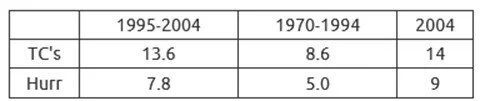
While offering continuous Twitter commentary, he summarized the AR6 conclusions on extreme weather events and climate in the table below.

Exhibit 2. IPCC View On Weather Events SOURCE: Roger Pielke Jr.
To understand the chart, one first must understand how the IPCC reaches its judgements about climate. It uses a two-step process – detection (identifying changes in climate) and attribution (explaining why identified changes may have occurred). Here are IPCC definitions:
Detection of change is defined as the process of demonstrating that climate or a system affected by climate has changed in some defined statistical sense, without providing a reason for that change. An identified change is detected in observations if its likelihood of occurrence by chance due to internal variability alone is determined to be small, for example, <10%.
Attribution is defined as the process of evaluating the relative contributions of multiple causal factors to a change or event with an assessment of confidence.
Pielke Jr. used global average surface temperatures as an example to explain to his readers how the IPCC process works. He wrote:
Let’s look at an example showing how the IPCC employs this framework, with a focus on global average surface temperatures. The figure below (3.4b) shows change global average surface temperature for several methods from 1850 to 2020.

Exhibit 3. Keeling Curve Shows Steady Rise In CO2 Concentration In Atmosphere SOURCE: NOAA
You don’t have to be a statistician to see that temperature since 1900 has increased as compared to an earlier reference period of 1850 to 1900. This indicates a change in climate for this metric. In the vernacular of the IPCC, detection has been achieved.
Once a change in climate has been detected, the next step is to explore why. It is important to understand that just because a weather or climate variable exhibits change over climate time scales (typically 30 years or longer) does not tell us why that change has occurred.
The IPCC uses computer models to explain observed changes in global temperature. The figure below (SPM.1b) shows global average surface temperatures from computer models that are run with and without human contributions to climate. The black line shows the historical observations, as above.

You can see that the computer models run with human factors much better matches historical observations. This is one (of several) bases for the IPCC’s conclusion that the detected change in temperatures can be attributed to human factors.
Of the 16 extreme weather and climate events assessed by the IPCC in AR6 and summarized in Pielke Jr.’s table, only about a third (5) have been detected and attributed to climate. Those five events were: heat waves, heavy precipitation, ecological drought, agricultural drought, and fire weather. What is significant is where the data did not detect extreme weather events and the IPCC could not assess whether climate paid any role. Those extreme events included: flooding, tropical cyclones (hurricanes), thunderstorms, tornadoes, winter storms, hail, lightning, and extreme winds. These findings are consistent with previous IPCC assessments.
With respect to drought, the IPCC did not find meteorological drought or hydrological drought. This is interesting, as prior to AR6 the IPCC grouped these two events along with two others - ecological drought and agricultural drought - under the broad category of drought. It points to the evolution of the IPCC’s assessment methodology.
In 2013, when AR5 was issued, Pielke Jr. wrote a newspaper column in which he offered observations about the report’s conclusions on extreme weather events and climate. Drought was one of those he mentioned. He was subsequently attacked by critics, including by Whisleblower.com, accusing him of ignoring the details from AR5. In their criticism, they wrote this about the drought conclusion:
The AR5 describes increases in droughts in specific regions, and suggests a connection to anthropogenic climate change.
Researching further, we found the following details from a one-page poster issued by the IPCC. The heading and authorship of the report was listed thusly:

Exhibit 3. IPCC Poster On Drought In AR5 In 2017 SOURCE: IPCC
The expansive IPCC discussion of drought was in the following section:

Exhibit 4. How The IPCC Sold Worst Case Scenario For Drought SOURCE: IPCC
Note that the AR5 scientists had “low confidence in an observed global-scale trend in drought,” as well as “in attributing changes in drought over global land areas since the mid-20th century to human influence.” The IPCC said it had high confidence in drought being greater and lasting longer prior to the “beginning of the 20th century in many regions.” They also had “high confidence that the frequency and intensity of drought since 1950 have likely increased in the Mediterranean and West Africa and likely decreased in central North America and northwest Australia.”
We are still wondering what the critics of Pielke Jr. thought AR5 was saying. But then it became clear when you look at the second portion of the highlighted box (above) dealing with “Projections of drought by 2100 in RCP8.5.” There is likely (medium confidence) about decreased in soil moisture and increased agricultural drought, and likely with high confidence for surface drying by 2100 under RCP8.5. So why did the IPCC scientists focus on RCP8.5? There were three other RCPs in the report – each with a lower carbon forcing number. A forcing is represented in terms of watts per square meter (W/m2) of the Earth's surface. It represents the extra energy entering the Earth near the top of the atmosphere. Thus, the larger the W/m2 value, the greater effect the change will have on climate overall.
The IPCC developed four Representative Concentration Pathways (RCPs), each with a different carbon forcing, to be utilized in climate models to predict the climate in 2100. RCP8.5 contained the most extreme economic and population growth assumptions of the various RCPs. Previously, the IPCC developed detailed socioeconomic storylines to generate future emissions and climate scenarios. Because these storylines required extensive time to develop and there was much new data needing to be integrated into the new scenarios, the IPCC concluded they had insufficient time to create them for use in AR5. Therefore, a shortcut was developed - RCPs.
One consideration was that the RCPs needed to be materially different to facilitate climate modeling. The RCPs utilized radiative forcing measures, which combine the effects of greenhouse gases, aerosols, and other factors that can influence climate to trap additional heat. The four RCPs were based on their end-of-century radiative forcing. RCP2.6 indicated a 2.6 W/m2 forcing increase relative to pre-industrial conditions, with the others being RCP4.5, RCP6.0, and RCP8.5.
RCP8.5 was the most extreme “no climate policy” scenario developed. The following chart from AR5 highlights four key assumptions underlying RCP8.5. It assumed the lowest economic growth, but highest population growth forecasts. It assumed there was little international trade conducted, meaning countries relied more on their own internal energy supplies and economic strengths. RCP8.5 also assumed little technological progress in emissions control technology and in improving overall energy efficiency in the economy.

Exhibit 5. Key Assumptions Underlying RCP8.5 SOURCE: IPCC
The top left chart shows that GDP growth was assumed to be only about one-third of the fastest economic growth projection. On the other hand, population growth (upper right chart) showed almost the highest rate possible. These two assumptions translate into stagnant improvement in living standards. World primary energy used in RCP8.5 was close to the top of the projection range, while energy intensity of the economy declined at a slower than historical improvement rate. Combined, these four factors produced a scenario with the most carbon in the atmosphere – over twice what exists today – and the most coal used for power.
Coal use is shown in the following AR5 chart.It shows the evolution of fuel use over 2000-2100 for RCP8.5.The bars to the right show the 2100 fuel mix for the less radiative forcing scenarios.RCP8.5 consumes the most energy, confirmed by the gray segments in the bars marking savings in primary energy used.One can also see coal’s use, roughly 800 exajoules (EJ) for RCP8.5, compared to roughly 250 EJ for RCP6, 125 EJ for RCP4.5, and none in RCP2.6.

Exhibit 6. Energy Mix In RCP8.5 Versus Other Scenarios SOURCE: IPCC
The outcomes of the RCPs were due to their underlying assumptions and their interactions in climate models. The key fuel consumption estimates reflected the belief countries would exhaust their cleaner fossil fuels first, and then rely on their prolific coal resources. With little technological improvement in reducing carbon emissions, increased coal use caused carbon emissions to grow virtually unchecked.
The RCPs were used as shortcuts for policymakers and the media in describing outcomes depending on policy measures to control emissions. By tying many of its analyses to RCP8.5, the IPCC left policymakers and the media believing RCP8.5 was the “business-as-usual” scenario. The drought poster demonstrated the IPCC’s deliberate messaging of future climate catastrophes.
Further to this point about emphasis, Pielke Jr. presented the table below showing the percentage of mentions for each RCP scenario in AR5. For RCP8.5, the percentage was 31.4% in the Working Group 1 report (WG1), higher than for any other scenario. Going across to the sum of the mentions in all the WG reports, the RCP8.5 percentage of mentions grew to 34.0%.

Exhibit 7. Mentions Of RCPs In IPCC AR5 SOURCE: Source: Roger Pielke Jr.
In AR6, the IPCC shifted back from its RCPs to Shared Socio-economic Pathways (SSP). These scenarios are identified by two numbers. The first number designates the socio-economic trends underlying the scenario, while the second number designates the level of radiative forcing. In his AR6 comments, Pielke Jr. presented a chart showing the mentions and percent of mentions for the various RCPs and SSPs. His chart showed the combined mentions of the two highest scenarios – SSP5-8.5 and RCP8.5 is 41.5%. If you include the SSP3-7.0 scenario (11.5%), the mentions of the highest radiative forcing scenarios total 53.0%. This is despite the IPCC acknowledging that these high radiative forcing scenarios have a “low likelihood” of occurring, and that the organization had taken a “neutral” position with respect to the various SSP scenarios.

Exhibit 8. Mentions Of Worst-Case Climate Scenarios SOURCE: Roger Pielke Jr.
The trend in the number of mentions, along with their weight in the IPCC AR discussions, should be of concern to readers. If the IPCC is relying on the science, then it should be presenting what that science tells us, as well as the confidence the thousands of scientists have in their scientific conclusions. These two conditions seem to be diverging at an important time. Moreover, the media relies on the statements of U.N. leaders rather than the text written by the scientists. We understand that the media is motivated by “clicks” on their news stories, which means assigning them scary headlines and, unfortunately, distorting the data and conclusions of the scientists with lazy writing. Just as with Covid-19 controversies, the media needs to be accurate and balanced. Unfortunately, most climate reporters are not.
It is important to understand that there are fundamental issues with the workings of the IPCC and its assessment reports that often lead to more biased outlooks than the science supports. Let’s start with the following two charts taken from the 2010 Guidance Note for Lead Authors of the IPCC Fifth Assessment Report on Consistent Treatment of Uncertainties. You may have noticed when we discussed drought that there were qualifiers about the confidence in these views by the scientists. Seldom, if ever, do you see any qualifying language in news stories or in political discussions about climate change conclusions drawn from IPCC reports.

Exhibit 9. Important Matrix Explaining IPCC Validity Of Climate Findings SOURCE: IPCC

Exhibit 10. How IPCC Judged Likelihood Of Climate Events Happening SOURCE: IPCC
These qualifying judgements about climate validity, as well as their likelihood, are important in the climate change discussion and should not be ignored. Medium agreement with medium evidence and a likely outcome suggests the climate event may be only about a two-in-three chance of happening. That is far different than high agreement with robust evidence and a virtually certain likelihood scenario, or close to 100% chance of happening. With an extensive array of condition descriptions, presenting every climate event as similar provides a disservice to readers and policymakers.
Another example of ignored but critical data in climate discussions is the calculation of margins of error when estimating data. When we hear the National Oceanic and Atmospheric Administration (NOAA) say July was the “hottest” month on record, it fails to tell you that the margin of error for their calculation exceeds the estimated monthly temperature change calculated. For example, as pointed out by Wall Street Journal columnist Holman Jenkins, “the margin of error in this measurement was 10 times as large as the purported difference over the previously claimed hottest month of July 2016.” In effect, July 2021 may not have been any hotter than July 2016, and it is possible it might have been cooler.
A problem with the temperature data is that taking point-to-point measures may not signal any change, but when measured over longer time periods warming trends become obvious. A data set maintained by scientists with the University of Alabama Huntsville that collects the readings from instruments on satellites gives a different reading of temperature changes, suggesting they are not rising as much as surface temperatures indicate.
It is important for readers to understand the IPCC mandate. In 1989, the agency was charged with investigating the “risk of human-induced climate change.” That is clearly what it is doing. It is not to investigate ALL the scientific issues involved in climate change.
Immediately below is what is under the history tab on the IPCC web site. Notice its “initial task” was to review and prepare a report on “the state of knowledge of the science of climate change.” It appears the IPCC was to examine all the science of climate change initially.

Exhibit 11. Initial History Of The IPCC Creation SOURCE: IPCC
That focus appears to have changed in 1998 when the IPCC’s principles over its operations were approved and published. The first paragraph under the Role, sets forth the focus shift to “human-induced” climate change.


Exhibit 12. How IPCC Mission Changed After First Decade Of Operation SOURCE: IPCC
Paragraph 3 under ROLE also establishes peer review of the documents involved in the report, as well as the requirement the report be reviewed and, as we understand, approved by governments. That is why the Summary for Policymakers report is written as a political document, since it must get the ok of all the UN member governments, and the message is directed at politicians and regulators. Since scientists do not write this report, and it’s the report read by most people and the media, it becomes easy for distorted views of what the science confirms to become the narrative.
It is also important to understand the politicization in recent years of climate science research, as well as at the IPCC, because it influences what is published and the emphasis placed on the research. The most famous incident was Climategate, in which numerous emails from scientists at the Climatic Research Unit (CRU) at the University of East Anglia in the U.K. were hacked. CRU is the center of Britain’s climate research and home to one of the leading global temperature databases maintained by climate scientists.
Although we have covered this incident in greater detail elsewhere, the short version is that the emails revealed climate scientists collaborating to prevent contrary climate research and views from being published in scientific journals and presented at academic conferences. Many of the emails detailed efforts involved in defending the hockey stick temperature graph created by Michael Mann and his use of mathematical tricks in the process. The emails also showed how the scientists avoided complying with Freedom of Information Requests (FOIA), violating national laws.
While Climategate exploded in late 2009, we have the early 2005 public letter by climate scientist Christopher Landsea withdrawing from participating in the writing of AR4 in which he highlighted his perception of the politization of climate research. Landsea has a doctorate in atmospheric science and currently is the Science and Operations Officer at the National Hurricane Center, as well as being the lead scientist in the Atlantic hurricane reanalysis unit since 1997. In 2004, Landsea was asked by the Observations chapter Lead Author Dr. Kevin Trenberth to provide the writeup for Atlantic hurricanes for AR4.
Several months later, Trenberth appeared at a press conference at Harvard University where the topic was "Experts to warn global warming likely to continue spurring more outbreaks of intense hurricane activity." Landsea wrote that after listening to and reading the transcripts of the press conference and media interviews, he was convinced that Trenberth was accurately quoted. He also believed that the summaries of Trenberth’s comments were not misrepresented. He then went on to write in his letter:
I found it a bit perplexing that the participants in the Harvard press conference had come to the conclusion that global warming was impacting hurricane activity today. To my knowledge, none of the participants in that press conference had performed any research on hurricane variability, nor were they reporting on any new work in the field. All previous and current research in the area of hurricane variability has shown no reliable, long-term trend up in the frequency or intensity of tropical cyclones, either in the Atlantic or any other basin. The IPCC assessments in 1995 and 2001 also concluded that there was no global warming signal found in the hurricane record.
Trenberth responded saying that there had been some misquotes. He also minimized the role that Landsea was to be playing in AR4. In later revisions of his criticism of Landsea, Trenberth pointed to two articles published in June 2005 supporting the view that global warming was contributing to an increase in the frequency and intensity of Atlantic hurricanes. He also pointed to the record number of tropical storms in 2005 as further substantiation of his opinion expressed at the 2004 press conference.
On his employer’s web site, Trenberth posted his views on hurricanes as of late 2004. They are listed below:
There is large natural variability of hurricanes. We cannot say anything about increases in numbers or frequency from the record or how these may change in the future.
However, the environment in which the hurricanes are occurring is clearly changing, and those changes are part of global warming.
For the past 10 years the sea surface temperatures (SSTs) have been higher from 10-20°N in the Atlantic, where the hurricanes form and track, than at any other time in the record through the 20th C.
During this period 8 out of the 10 years had above normal numbers of hurricanes and the 2 exceptions were El Niño years when the main activity shifts to the Pacific.
5. Hence there is every reason to think that these changes should increase the intensity of hurricanes and rainfalls associated with hurricanes.
6. We cannot say anything much about the 4 hurricanes that hit Florida, except that the rainfalls and flooding were likely enhanced by global warming.
7. The IPCC in 2001 also states that hurricanes are likely to become more intense with stronger winds and heavier rainfalls.
8. While the influence of climate change on hurricanes may not be detectable because of large natural variability, this does not mean that there is no influence.
Other than the table showing the increase in tropical storms and hurricanes for different periods, all the views offered by Trenberth are suppositions based on logical assumptions and presumably tied to the data. We are now two IPCC assessment cycles further on in the collection of storm data and analyses. However, as we showed above, the IPCC did not detect or find any attribution of climate change for tropical cycles (hurricanes). What it did find, based on the paragraph from the Summary for Policymakers, is the following:
A.3.4 It is likely that the global proportion of major (Category 3–5) tropical cyclone occurrence has increased over the last four decades, and the latitude where tropical cyclones in the western North Pacific reach their peak intensity has shifted northward; these changes cannot be explained by internal variability alone (medium confidence). There is low confidence in long-term (multi-decadal to centennial) trends in the frequency of all-category tropical cyclones. Event attribution studies and physical understanding indicate that human-induced climate change increases heavy precipitation associated with tropical cyclones (high confidence) but data limitations inhibit clear detection of past trends on the global scale. (emphasis added)
While the IPCC has low confidence in the trends in the frequency of tropical storms, it is sure that the number of major hurricanes (Category 3-5) have increased since 1980. We know that since the 1980s, satellite storm tracking has given us a better count of total storms experienced each year and their details. Prior to the satellite era, knowledge of tropical storms depended on them being encountered by ships or reaching land. A June 2021 peer-reviewed paper has calculated that the number of hurricanes that occurred in the pre-satellite era was like the number experienced since 1980.
Another IPCC frustration involved Roger A. Pielke, Sr., an emeritus professor of the Department of Atmospheric Science, along with being a Senior Research Scientist at the Cooperative Institute for Research in Environmental Sciences at Colorado State University. He was asked to review the first and second drafts of the WG1 report for AR6. He published his letters to the IPCC. In the initial letter, he made numerous suggestions regarding substantive changes to the presentation’s wording, as well as dealing with several specific attribution topics. His second letter – a one-pager – was written immediately after he read the second draft and reflects his frustration. In that second letter, he wrote:
In reviewing the latest draft, I am very disappointed that none of my comments were responded to in the report, nor even in any point-by-point response to my specific comments. It was wasted time for me to prepare my comments.
I was hoping that this time the IPCC process would be inclusive and assess the diversity of perspectives by climate scientists. This is clearly not the case.
The WG1 report, as currently drafted, will be seen by many in my community as a continuation of using the IPCC process as an advocacy for a particular view on the subject. With so much at stake, this, in my view, is an abrogation of what the IPCC was tasked to do in providing an objective peer reviewed-based assessment of the role of humans in the climate system and estimating resulting risks. The WG1 draft has failed with respect to this goal.
This was a significant inditement of AR6 by an acknowledged climate scientist. A more egregious politization of the IPCC assessment process was documented by Pielke Sr.’s son. He presented the following information, along with examining other issues including conflicts of interest of key IPCC officials, in a talk in Delft, Netherlands in November 2015. Pielke Jr. focused on the Hohenkammer Workshop in May 2006, of which he was a co-organizer. The workshop was to provide information for AR4 to be issued in 2007. Its focus was on the relationship between human-caused climate change and increasing disaster losses, an area of climate research in which he is an expert. The co-sponsors of the workshop were the U.S. National Science Foundation, insurer Munich Re, GKSS Institute for Coastal Research, and the Tyndall Centre for Climate Change Research. There were 32 participants from 16 countries and 24 background “white papers” were presented.
After the conference reached its unanimous conclusion and forwarded it to the IPCC, Pielke Jr. was shocked to read the conclusion from AR4 dealing with the workshop’s topic. The IPCC conclusion is pictured below:

Exhibit 13. IPCC View On Disaster Damages And Climate Change SOURCE: Roger Pielke Jr.
The one workshop paper referenced by the IPCC had been requested by the workshop’s organizers; however, it was never delivered. The paper was authored by Robert Muri-Wood and others in 2006. The AR4 discussion referenced the chart below:

Exhibit 14. IPCC Deceptive Chart Linking Climate And Damages SOURCE: Roger Pielke Jr.
Pielke Jr. noted that the IPCC graph above does not appear in the Muir-Wood et al., 2006 paper, nor does the underlying data. The chart attempts to link warming and disasters. Pielke Jr. told his Delft audience: “In early 2010 during a public debate at the Royal Institution in London, Robert Muir-Wood revealed that he had created the graph, included it in the IPCC and then intentionally miscited it in order to circumvent the IPCC deadline for inclusion of published material.”
According to Muir-Wood, the IPCC Lead Author, the graph should never have been included in AR4. It is also interesting that Risk Management Solutions (RMS), the company that employed Muri-Wood, also issued a public statement agreeing that the chart should not have been included. However, RMS predicted in 2007 that the risk of U.S. hurricane damages had increased by 40%, necessitating much higher insurance and reinsurance premiums. That increase was estimated by analysts at $82 billion.
Pielke Jr. also offered two slides with comments from reviewers of early drafts of AR4 that questioned the conclusion and the use of the chart. To the second reviewer’s comment, the IPCC attributed a response to Pielke Jr. that he did not offer.

Exhibit 15. Expert Comments On Draft On Climate And Disasters SOURCE: Roger Pielke Jr.
The saga went on. The chart was associated with a paper published later, for which Muir-Wood was a co-author, but which reached a different conclusion that citied in AR4. The paper, Miller et al., 2008, stated: “We find insufficient evidence to claim a statistical relationship between global temperature increase and normalized catastrophe losses.”
On January 24, 2010, the U.K. SundayTimes published an article entitled: “UN wrongly linked global warming to natural disasters.” This article drew a significant response from the IPCC, who issued a press release. Pielke Jr. highlighted several key quotations

Exhibit 16. IPCC Reacts To Sunday Times Article On Deceptive Chart In AR4 SOURCE: Roger Pielke Jr.
What do we know about how the IPCC operated with respect to this issue? It relied on one paper reportedly submitted to the panel, while ignoring the panel’s conclusions and recommendations because the paper supported the IPCC’s narrative. It used a misleading chart that did not exist in the literature either before or after AR4 was published, and the underlying data was not published. Furthermore, the IPCC ignored its official procedures by citing a paper that did not contain the reported chart, rejecting the comments of its reviewers who asked for the chart to be removed, and making up a response from Pielke Jr. It then issued a press release attacking the Sunday Times for accurately reporting on the IPCC’s miscues. This was the IPCC’s integrity on the science of an important climate change issue. The political bias of the IPCC showed through.
More recently, in AR6, on the topic of human-caused climate change and rising costs of disasters and damages, the IPCC cited a research paper with 24 professional citations, while ignoring a paper co-authored by Pielke Jr. with nearly 1,200 citations. The more cited paper did not support the IPCC narrative, thereby it was ignored. The science did not prevail.
Another recent incident was the IPCC’s use of a hockey-stick-shaped global temperature chart in AR6. The chart below, the first one in the report, was only offered in the Summary for Policymakers, not in the scientific volume. Since the summary document is read by politicians and the media, the use of the chart helps the IPCC to visually “sell” its message on global warming and humans being the cause.

Exhibit 17. IPCC Case For Global Warming And Humans Role In Creating It SOURCE: IPCC
The graph in the left-hand portion of the chart shows the historical record of global temperature deviations from a long-term average during 1 AD to 2020. The graph highlights the period – 1850-2020 – where temperatures were more accurately measured compared to earlier years where the temperature data is “reconstructed.” On the far left of the graph is a bar extending from 0.2 to 1.0 degree-changes labeled as the “warmest multi-century period in more than 100,000 years.” That bar, however, is based on the “reconstructed” temperature data.
The right-hand graph displays the observed temperature data for 1850-2020. This graph breaks down the trend in the data between how much of the temperature change comes from natural sources – solar and volcanic – compared to how much is from combined human and natural factors. This graph is designed to support the IPCC’s statement that it is “unequivocable” that humans caused the recent warming.
We know that before 1850, when thermometers were first used to measure temperatures, estimating prior temperatures relies on tracking how things grew. To perform the analysis correctly, it is important the data series be consistent around the world, which presents significant problems. For example, one set of temperature data proxies used in creating the hockey stick graph comes from locations between latitudes 60º - 30º S, i.e., a swath across the Southern Hemisphere shown in the map below. Note that 96% of the area is water. The red dots indicate the locations of the proxy data used in the analysis. The creators of the hockey stick graphs used only seven tree ring data series – two from New Zealand (both with less than 500 years of data), three from Tasmania (one longer; two less than 500 years), two from South America (both less than 500 years), and one relying on pigments in lake sediment from Chile. There were no ocean proxy data series used, which would normally be coral.

Exhibit 18. Southern Hemisphere Dearth Of Temperature Data Sets SOURCE: climateaudit.com
Because of the sparseness of data series, climate studies often focus on the Northern Hemisphere because there is much more land mass and sources of tree ring and sediment data. A reason Southern Hemisphere data is favored is because there is less potential for pollution due to the lack of land masses. However, it limits the number of proxy data sets available.
Besides proxy data selection issues, there are also mathematical questions. Canadian scientist Stephen McIntyre took apart both the data selected and the mathematics underlying the hockey stick chart created by climatologist Michael Mann in 1999. The mathematical “trick” was how he linked unequal data series together to create the “blade” of the hockey stick. He also selected data that most closely supported his preconceived goal. Data was deselected when it deviated from the trend line Mann wished to create. The questioning about the trick used by Mann to create the graph was ongoing within the global warming community at the time, but not as visible to the outside world until Climategate revealed it in the hacked emails.
One email, written in 1999 by Professor Phil Jones, the U.K.’s top climate scientist at the CRU stated the following (bold added):

Exhibit 19. Incriminating Climate Email From Climategate SOURCE: climatechangedispatch.com
The email showed that the data was being manipulated to match the modern data and to distort the historical data. The controversy over the trick and data selection led to bickering within the climate alarmist community, especially after it was questioned by other climate scientists. The highlighting of the graph by the IPCC in 2003 further stirred up the fight.
As Keith Briffa, a climate scientist, wrote in one of his emails about his frustration with Mann during the debate:
I am sick to death of Mann stating his reconstruction represents the tropical area just because it contains a few (poorly temperature representative) tropical series. He is just as capable of regressing these data again any other “target” series, such as the increasing trend of self-opinionated verb[i]age he has produced over the last few years, and … (better say no more)
Obviously, Briffa was tired of the bickering ongoing over the hockey stick graph and its creation. The battle, however, was only beginning. Papers critical of Mann’s graph began appearing in 2003 and continued for the next two years. As a result, in 2005, the U.S. Congress asked the National Research Council’s Board on Atmospheric Sciences and Climate to form a committee to examine the question of global temperatures over the past 2,000 years. As reported by encyclopedia.com:
The committee concluded that the hockey stick graph is essentially valid. “It can be said with a high level of confidence,” the committee wrote, “that global mean temperature was higher during the last few decades of the 20th century than during any comparable period during the preceding four centuries.” However, it also noted that as one goes further back in time, uncertainty increases. Therefore, they said, less confidence can be placed in currently available temperature reconstructions from 900 AD to 1600 AD, and very little confidence can be placed in reconstructions of temperature before 900 AD.
Regarding the work of Mann et al., the committee wrote that their basic conclusion—namely that the late twentieth-century warming in the Northern Hemisphere was unprecedented over at least the last 1,000 years— “has subsequently been supported by an array of evidence,” although “not all individual proxy records indicate that the recent warmth is unprecedented.”
The controversy did not end there. At the request of a U.S. congressman, National Academy of Sciences mathematicians specializing in statistics investigated the methods used by Mann and his colleagues. The group’s 2006 report stated that the mathematical methods employed were defective and the criticisms by McIntyre and his colleague were valid.
Climatologists argued that the report did not address other climate history reconstructions that agreed with the hockey stick graph. They also argued that corrections to the math used by Mann et al. left the shape of the graph unchanged. The following year, the IPCC published a report called “Climate Change 2007: The Physical Science Basis.” It examined the hockey stick graph controversy and related science. The scientists at the IPCC created a graph overlaying a dozen reconstructions of average Northern Hemisphere air surface temperatures for the last 1,300 years. They all agreed with the hockey stick rendition of historical global temperatures. The IPCC also dismissed the mathematical questions as having been addressed by other scientists. Does this sound like a fox and hen house situation?
The hickey stick debate shifted to courtrooms, as Mann sued several bloggers and their platforms for defamation over their comments about him and his graph. The most high-profile case involved Canadian climate scientist Tim Ball. In a nine-year-long legal battle that ended in a Victoria, B.C. court in 2019, Ball’s dismissal motion against Mann’s defamation charge was granted and Ball was awarded full legal costs. Mann claimed Ball did not win his case because none of his claims were upheld. However, Mann lost because he abused the discovery process and refused to turn over to the court his mathematical data and calculations underlying the hockey stick graph, which would have proven or disproven Ball’s claims. There are still Mann defamation cases ongoing, and Mann’s data continues to be hidden.
Below is the heart of the defamation lawsuit between Ball and Mann. The Mann version of temperature history eliminates the Medieval Warm Period of 1100-1300 AD, as well as the Little Ice Age, conventionally dated between the 16th and 19th centuries. Others define that period as lasting from 1300 to 1850 AD. The NASA Earth Observatory notes three particularly cold intervals beginning about 1650, then about 1770, and the last about 1850. These cold periods were separated by slightly warmer intervals. The IPCC says the ice age was a regional cooling phenomenon, rather than a global glaciation experience.

Exhibit 20. The Battle Over Erasing Known Climate History SOURCE: principia-scientific.com
With the IPCC AR6 presenting a hockey stick graph to make its point about global warming to policymakers, it has reopened the debate over how such a graph is created. At the heart of the debate is the problem with the proxy data. As the 2005 National Research Council report on the hockey stick graph concluded, the further back in time one goes, the less certain the proxy data is for confirming global temperatures. In recent articles, McIntyre has been presenting the case that random selection of proxy temperature data series does not allow for the recreation of the AR6 hockey stick graph. Since the data and computer code have not been released, we are left to assume that the graph is an accurate representation of the history of changes in global temperatures. Given the experience with the previous graph, doubts can be justified.
McIntyre showed that for proxy data from the 0º - 30º S network there are 46 proxies, as compared to only eight for the 60º - 30º S network. Of the 46, only one proxy comes from an ocean core and two from land data. The remaining 43 data series are all very short coral series. There are only two proxies with values prior to 1500 AD – the ocean core from Mg/Ca at Makassar Strait, Indonesia, and the ice core d18O series from Quelccayal, in the Andes Mountains in Peru, updated in 2013. Neither of these data series contains a hockey stick pattern, however, they do show declines during the assumed Little Ice Age.

Exhibit 21. Only Two Long-Term Temperature Proxy Data Series For Hockey Stick Graph SOURCE: climateaudit.org
When he focused on proxies that begin prior to 1600 AD, the Hendy (2002) Great Barrier Reef (GBR) temperature reconstruction does not have a hockey stick pattern. However, a non-descript, in the underlying measurement data at the National Oceanic and Atmospheric Administration (NOAA) web site, Indonesian tree ring series (IND0005) appears to have such a spike at the end of the series. McIntyre found that numerous other Asia tree ring data series also spike at the end. He said he inquired about the chronology of these series from the lead authors of the pages that contain the data series, but they do not know and have refused to find out.

Exhibit 22. Asia Tree Ring Temperature Proxy Versus GBR Coral Temperature Proxy SOURCE: climateaudit.org
For the 43 short and micro-short coral series, including the Hendy GBR series, McIntyre presented a histogram of their start dates. Half of them start after 1850, with at least 30% of them after 1890. One series even doesn’t begin until 1942. The result of these proxies is that they offer no guidance about whether the medieval period was warmer than the modern period or not.

Exhibit 23. Most Coral Temperature Proxies Series Have Short-Term Duration SOURCE: climateaudit.org
When using corals for temperature proxies, there are various issues. As McIntyre pointed out, the coral proxies show substantial change in d18O and/or Sr/Ca in the 20th century. The reason is that these measures estimate temperatures differently. Delta-O-18 (d18O) is a measure of the ratio of stable isotopes oxygen-18 (18O) and oxygen-16 (16O). The ratio is commonly used as a measure of the temperature of precipitation. In paleosciences, 18O and 16O data from corals are used as a proxy for temperature. The other measure, the ratio of strontium (Sr) to calcium (CA) is also used to estimate sea-surface temperatures but appears to have a more accurate history.
Using a statistical sampling technique, McIntyre sampled the 43 coral data proxies. His sample is shown below:

Exhibit 24. McIntyre’s Sample Of Coral Temperature Proxy Data Series SOURCE: climateaudit.org
Amazingly, the sample included the Hendy 2002 GBR series, which has a different shape compared to the other coral series. McIntyre points out that the network of data series from which the proxies were selected is primarily populated with d18O series, which are seldom used as a temperature proxy by climate scientists, as Sr/Ca series are preferred. That is because the changes in d18O series are more pronounced than corresponding changes in Sr/Ca coral series. The difference is due to d18O coral being very responsive to rainfall amounts. Since many of the 20th century coral proxies within the 0º - 30º S band are located along convergence zones where there is more rainfall, the data may be distorted. McIntyre is also interested in exploring why the IPCC and the coral data collectors prefer d18O series.
As the graphs demonstrate, all the coral series other than the Hendry 2020 GBR series decline at their end, i.e., in most recent years, rather than spike.
Without answers from the data collectors and the scientists creating the graph to McIntyre’s critique of the latest hockey stick shape, we are left wondering whether the graph was created merely for political purposes?
Where do we stand on climate change? We have a pronouncement from the IPCC about coming catastrophes without immediate and severe anti-fossil fuel policies being implemented. We have a definitive statement that humans have been and are the cause of modern global warming. At the same time, we have had a reduction in the uncertainty of the degree of warming to be experienced in the future. But amazingly, the central value for the warming increase remains at the same level ‒ 3º C (5.4º F) ‒ it has for 42 years. These estimates are all based on climate models that have overestimated the temperature record of the past. We have climate scientists and climate models that ignore clouds and the sun as having anything to do with our climate.
That’s how you get no impact from natural phenomenon on temperatures and climate change. One wonders why, after 42 years, we have progressed so little in understanding our climate? Is it because the science is more complicated than we can easily understand, or is it because predicting catastrophic outcomes keeps the scientific research dollars flowing?
A few weeks ago, Judith Curry, who not long ago retired as chair of the School of Earth and Atmospheric Sciences at the Georgia Institute of Technology due to political pressure exerted on her and is now the proprietor of Climate Forecast Applications Network that provides weather and climate forecast information to businesses, was on a sustainability panel at the American Chemical Society annual meeting. A few of her slides provide a good wrap-up of the state of climate change research ‒ where we stand and the challenges of solving our problem. (We will have more to say about that latter point in our next Energy Musings.)
The climate change narrative is accurate. However, it fails as a motivator for several reasons, primarily because it ignores the uncertainty, which compounds the challenge of explaining such a complex issue. Simple solutions that appeal to policymakers and climate activists, who strive for political control, fail to deal with the global scale and disparate economic and social conditions existing around the world.

Exhibit 25. Defining The Climate Crisis With Issues And Knowledge SOURCE: Judith Curry
While the IPCC is attempting to answer some of the questions about climate science that are uncertain, climate activists fail to concede on the complexity of the issues. Therefore, their criticism is directed at anyone asking questions and does little but inflame the debate.

Exhibit 26. What Climate Scientists Know And Don’t Know SOURCE: Judith Curry
Extreme weather exists, but it has throughout history. Moreover, the latest IPCC AR6 report demonstrates that many of the extreme weather events researched cannot be tied to global warming – a consistency in forecasts. This is good news for society, but it hurts the narrative when climate activists must acknowledge the inability to tie weather events to human-caused climate change.

Exhibit 27. Extreme Weather Events Are Not Shown To Be Driven By Global Warming SOURCE: Judith Curry
Net zero by 2050 has become not only a goal, but increasingly a mandate. But it is based on uncertain knowledge. The idea of considering an “all of the above” energy fuel mix has been dismissed under the guise of a “climate catastrophe,” when a fulsome discussion of options and targeted energy research could produce less destructive and costly solutions.

Exhibit 28. Pros And Cons Of Adopting Net Zero Emissions Policies SOUCE: Judith Curry
Curry’s final slide dealt with the politization of climate science. This is the sorry state to which we have degenerated. Challenges and questioning of the science and research should be welcomed, as the scientific process is all about advancing our knowledge and understanding issues via testing and challenging hypotheses. Instead, the debates rapidly shift into ad hominin attacks that contribute little to the discussion and turn off serious people seeking knowledge. A personal observation from all the climate science research we have been reading in preparation for writing our articles is how the ad hominin attacks all seem to come from one side – the activists.

Exhibit 29. The Politization Of Climate Science Has Serious Implications SOURCE: Judith Curry
There are many reasons to push for cleaner energy. Reduced carbon emissions can only improve our climate. That would be good. Maybe it will reduce extreme weather events. But that is not a given. Developing new low- or no-emission energy sources should be a high priority. However, their reliability and costs must be addressed honestly. Those new energy sources should be less burdensome on our economy and nature. It means they should not be increasing land use over the fuels they replace. They should be highly reliable. Moreover, they should have reasonable costs, as they will be needed to continue the advance in living standards worldwide that our current fuel mix has achieved. As American essayist H. L. Mencken once wrote, “There is always a well-known solution to every human problem – neat, plausible, and wrong.” Let’s hope that is not an accurate description of current climate policies. We need to get this right.
Global Gas And Coal Markets Say Likely Tight Winter Supply
In the United States, the moribund natural gas market has suddenly come to life. Futures prices have crashed through the $4 per thousand cubic feet (Mcf) barrier and currently are floating around $5/Mcf. Last Wednesday, gas futures prices spiked by $0.40/Mcf, pushing them briefly over the $5 barrier, a seven year high. Speculation is that there may have been a short squeeze, which is when an investor is forced to buy gas contracts to repay the owner of ones previously borrowed and sold. That spike likely represents a trading disconnect due to technical factors rather than fundamental considerations.
On the other hand, the last time gas prices were above $4/Mcf was November 2016 in response to an early winter blast of cold temperatures. Before that, it was November 2014, again in response to weather. The pricing action in the domestic gas market has reflected loose conditions (supply exceeding demand) only tightened when demand soared in response to cold weather. Things may be changing.
Natural gas prices began 2021 in the $2.70/Mcf range, falling to $2.50 before jumping over $3 in mid-February when the infamous ice storm blanketed the middle of the country, including Texas.During that time, Texas and Oklahoma gas output was hampered by the ice storm and cold temperatures. In other words, it took very cold temperatures to lift gas prices out of the $2-$3/Mcf range. Why are they now in the upper $4/Mcf range, and knocking on the door of $5? Storage injections for the past several weeks have been below analysts’ expectations. As of the week ending August 27, gas storage was 222 billion cubic feet (Bcf) below the 5-year average and 584 Bcf below 2020 levels. Last week’s injection was within the range of estimates, albeit above the average expected. These are signs gas supplies are not keeping up with demand while also providing sufficient volumes to rebuild storage. The devastation to Louisiana caused by Hurricane Ida has limited gas output from the Gulf of Mexico and within the state, contributing to reduced supply. At current rates of injections, gas supply is likely to end the injection season 300-400 Bcf below desired levels. That will help keep gas prices strong heading into and likely through winter.
This summer the nation experienced warm temperatures, but the shift in how electricity is generated in various regional electricity systems is also helping boost gas prices. When renewable power – wind and solar – fails to deliver the expected volumes of electricity, grid systems turn to natural gas plants for backup power to meet the supply shortfalls. That has been particularly true in the west where drought has also limited hydroelectric power supplies. As natural gas has been cheaper than coal, it has displaced that dirty fuel. Now that pricing dynamic is shifting in favor of coal, at least for the near-term.
U.S. gas markets have been playing a more important role in global natural gas supply, largely because our gas has been cheaper than oil-linked gas prices that determine much of the world’s gas supply. This pricing dynamic has helped U.S. LNG cargos compete in the European and Asian markets, and even in the South American market. That pricing dynamic is clearly seen in the chart below. Henry Hub prices are a fraction of gas prices in Europe and Asia. Dutch gas prices have risen from $4 to $18/Mcf over the past 12 months. Asian LNG cargo prices passed the $20/Mcf mark last week.

Exhibit 30. Natural Gas Prices Have Surged in Europe And Asia With Supply Crunch SOURCE: S&P Global Platts
After decades of pushing for a global gas market, much like what exists for crude oil that opens countries to supplies from around the world and spot pricing of cargos, it may finally be happening. U.S. LNG exports have been a major beneficiary of this evolution. The chart below shows how gross LNG exports have grown and how their share of the total U.S. gas market is growing. For 2021, the actual exports and forecasted volumes (EIA Short-term Energy Outlook) as a share of total marketed gas should average 9.5%. Next year, STEO projects LNG’s average share rising to 10% of projected gas supply, with December 2022’s share exceeding 11%, as additional export capacity comes on-line.

Exhibit 31. U.S. LNG Shipments Have Carved Out Meaningful Gas Market Share SOURCE: EIA, PPHB
In Asia, we have learned of gas buyers pushing their long-term LNG suppliers to boost shipments. That is because these long-term contracts are linked to crude oil prices, which have slumped due to slowing economic activity in response to the outbreak of Covid-19 cases. Weaker oil prices have put the gas-linked contracts on a par with or possibly below other supplies. The question is whether suppliers have additional volumes to ship.
In Europe, gas prices are at record highs as depleted storage is pushing them up, along with increased demand due to the underperformance of renewable energy.In both Germany and Britain, utility companies have restarted coal-fired power plants recently shut down in schemes to cut national carbon emissions.Two charts from the U.K. highlight what is happening in its power and natural gas markets.

Exhibit 32. Natural Gas Prices In U.K. Are Rising SOURCE: John Kemp

Exhibit 33. U.K. Power Prices Have Spiked And Remain High SOURCE: John Kemp
A contributing factor to high power and gas prices in the U.K. was the heat wave that sat over the island nation in early September. According to media reports, National Grid, the operator of the nation’s power grid, had to pay over £20 ($27.6) million one day, ten times more than normal, to balance the grid and avoid blackouts. Wind’s contribution to the U.K.’s power mix was only 1.9%, while coal’s share was 3.9%. This energy mix will be challenged in 2022 if similar weather conditions occur, as these two coal-fired power units are slated to be decommissioned next year.
The financial impact of the grid’s structure and the disruptions when renewables underperform is obvious. During the most recent episode, the reactivated coal units were being paid as much as £4,000 ($5,516) per megawatt-hour, an exceptional price. Analysts are projecting these “balancing costs” to avoid blackouts will reach between £1-2 ($1.4-2.8) billion this year. This cost is passed on to consumers in their electricity bills. Ofgem, the utility regulator in the U.K., just gave the greenlight for a 12% increase in electricity bills.
Another crazy policy move in the U.K. was converting its Drax coal-fired power plant, located in the Yorkshire coalfields, to burning wood pellets. Previously, the plant generated four gigawatts of power every day, all year, at a low, unsubsidized rate. Today, the plant burns 13 million tons of wood a year, the equivalent to a forest the size of Wales. Not only is the demand for wood impacting the British construction industry, but the U.K. is also forced to subsidize the plant to the tune of £890 ($1,225) million a year. Now the plant is being targeted for failure to control wood dust emissions, even though it had no problem controlling coal dust emissions. Are wood emissions more difficult to control than coal emissions?
Coal is also playing a greater role in Germany’s power market, currently, because renewables are failing to deliver anticipated supply and high-priced natural gas is too expensive. Significantly, even with record carbon pricing levies, generating power with coal is profitable.
A chart by Argus shows that 4Q2021 and 1Q2022 clean dark spreads for a 42% efficient coal-fired base-load power plant in Germany reached highs of €17.80/MWh ($21.03) and €25.60/MWh ($30.25), respectively, last week. The 4Q2021 clean dark spread has not been higher at any point for the past six years.

Exhibit 34. 42% Efficient Clean Dark Spreads At Peak Levels In Germany SOURCE: Argus
The analysts pointed out how power prices and the carbon levy impact the economic equation for burning coal. In a 42% efficient coal-fired plant, even though the cost of carbon has climbed in 2021 along with the cost of coal, the combined cost remains below the German power price, suggesting that coal-fired power plants are profitable. That means they will continue to operate until fuel pricing, carbon, and/or power prices change.

Exhibit 35. Higher Coal And Carbon Prices Still Leave Coal Profitable SOURCE: Argus
The impact of the carbon levy has grown over time. It represented only 12% of the coal-switching price in 2018, but today it is 36%. It was thought that putting a price on carbon would force the utility industry to switch to cleaner fuels. These charts show that this strategy has been less successful than expected. Does it mean Europe needs to raise the carbon levy to drive coal out of its power grids or are there other ways to achieve the same goal, i.e., mandating no coal-fired power plants allowed to operate? The former option suggests that electricity prices will be heading higher. The second option, without a sufficient buildout of renewables or other low- or no-carbon electricity supplies, means more blackouts. Neither are particularly attractive options.

Exhibit 36. Higher Carbon Pricing Has Not Made Coal Power Unprofitable SOURCE: Argus
The U.K. and German power markets offer windows into the challenges power grids and governments will face in their drive to achieve net zero economies. Consumers in both countries are growing uneasy about their economic futures as clean energy policies inflict meaningful financial costs on family budgets and high-power prices and more frequent power blackouts cost their business communities that will impact job markets. Americans should be watching closely. How these conflicts are resolved will be interesting to see.
History Of Hurricanes And Flooding In The Northeast
We watched with horror the landfalling of Hurricane Ida at Port Fourchon, a key operational center for the Gulf of Mexico oil and gas industry. Our thoughts and prayers go out to our friends and readers in Louisiana as they struggle to recover and rebuild after the storm. Our interest in Ida continued as the storm worked its way north to the Middle Atlantic and eventually Northeast states. From New Jersey through Pennsylvania and New York to Connecticut, Ida dumped substantial volumes of rain that caused record flooding in several areas and led to tens of deaths.
As we listened to the TV coverage and read the newspapers, the message was that this was record-breaking rain and flooding never seen before. Immediately, our mind turned to the devastation hurricanes and flooding had brought to our home state, Connecticut, in the past. In fact, we vividly remember the destruction of the Torrington in 1955 from rain associated with two hurricanes. Our sister was attending a music camp in the area during Hurricane Diane that delivered the coup de grace to the city. Our family had to drive up to pick her up at the end of camp, so we saw first-hand the devastation.
According to HomeFacts.com, Torrington, a city northwest of Hartford, “is in a very low risk hurricane zone. ”The site points out that 26 hurricanes have been recorded in the Torrington since 1930, with the largest hurricane being Carol in 1954.The definition of hurricanes hitting the region, defined as within 150 miles of the city, makes for some interesting inclusions and exclusions. What we know, and the statistics support, is that the 1950s marked a decade with significant storm activity throughout New England. The years 1954 and 1955 brought four storms to the area. NewEngland.com wrote about those two years and the storms:
Hurricanes Carol and Edna (1954)
Considered the most destructive storm since 1938, Carol touched down as a Category 3 on August 31, 1954. With 100 mph winds, sometimes gusting up to 135 mph, Carol caused 68 deaths and over $460 million in damage, including destroying 4,000 homes, 3,500 cars, and over 3,000 boats. In downtown Providence water depths reached 12 feet, and strong winds knocked down the spire of the historic Old North Church in Boston. The name ‘Carol’ was the first Atlantic hurricane name to be retired. Just days later on September 11, Hurricane Edna made landfall in Maine and went on to cause another 2 deaths and $40 million in damage, earning its own spot on the retired name list.
Hurricanes Connie and Diane (1955)
Hurricane Connie formed on August 3, 1955, starting as a tropical storm. It hit North Carolina on August 13, 1955, as a Category 2 hurricane. Bands of heavy rain and wind reached southern New England and damages totaled nearly $86 million. Days later, Category 2 Diane made landfall, causing significant flooding and damage throughout southern New England. Diane still holds the record for wettest hurricane to hit Massachusetts, with rain accumulation reaching 19.75 inches. It is recorded as the 2nd wettest hurricane in Connecticut and Rhode Island. Connecticut sustained $350 million in damages and had 77 deaths. In Massachusetts, damages totaled close to $110 million and at least 12 deaths were recorded. Rhode Island suffered $21 million in damages and had at least 3 deaths. Diane was the costliest hurricane of the 1950s, solidifying its place among the worst hurricanes in New England history. The names “Connie” and “Diane” have been retired.
Diane followed Connie to Connecticut by five days. The latter storm softened up the area with about 5 inches of rain, before Diane deposited 15 inches that caused the Naugatuck River to overflow its banks and devastate Torrington. The map below shows neither Connie nor Diane directly landing in New England.

Exhibit 37. Non-Landing New England Hurricanes Inflicted Serious Flooding SOURCE: weather.com
As we prepared to weather Hurricane Henri that was targeting Long Island, Rhode Island and New England in late August, the media focused on the last hurricane to directly hit Rhode Island. That was Hurricane Bob in 1991, 30 years ago. Fortunately, Henri traveled over some cool water, losing strength, and falling to tropical storm status as it made landfall. Its path was erratic as it approached land. Henri passed directly over Block Island, 9.9 miles southeast of our summer home. It then made an immediate left-hand turn and made landfall in Westerly, RI, the town next door to us. As a result, we were on the right-hand side of the storm’s eye, which meant rain and wind, but surprisingly little damage for us. It did knock out power to about 90% of Rhode Island, but fortunately our standby generator supported us for 34 hours. We lost our cable and internet service for a day, but the house was refreshingly quiet.
In researching the New England hurricane history, we knew of the 1938 hurricane from first-hand stories of family members. We assumed there had been other intense storms to hit the region, but we did not know when they occurred.

Exhibit 38. New England Has Been A Target Of Strong Hurricanes In The Past SOURCE: Geo.brown.edur
A spreadsheet of hurricanes making landfall in New England prepared by fivethirtyeight.com for the New York Times after Super Storm Sandy hit the region in 2011 shows some interesting data. We lived through the storms of the 1950s and 1960s. What we found interesting in the table was the estimated cost of the storms. The 1938 storm was estimated to have cost $45.3 billion. We found a cost estimate for the storm damage at the time of the storm, which we updated to 2021 dollars that pushed the total to $60 billion. Those estimates are for damage from a storm 83 years earlier when the region had substantially fewer people and was less developed. It is hard to imagine what a similar storm would cost today.

Exhibit 39. New England Has Had Its Share Of Strong Hurricanes SOURCE: Fivethirtyeight.blogs.nytimes.com
We have two other observations about the storm. Connecticut was hit by an earlier Henri in 1985, but it too was only a tropical storm. Secondly, a Wall Street Journal column by Bjorn Lomborg discussed the declining cost of flooding. It contained a chart of the annual cost of U.S. flooding. It showed that 1955 was the most expensive year up to 2019. That was the year we remember.

Exhibit 40. The Cost Of U.S. Flooding Has Been In Long-Term Decline SOURCE: wsj.com
Every hurricane is different. Every hurricane has a mind of its own as it travels through its life cycle. How it impacts regions will be different, especially given the heavy concentration of economic buildup along our coastlines. We should respect every hurricane, and people should prepare for the worst imaginable outcomes when one threatens.
Leveraging deep industry knowledge and experience, since its formation in 2003, PPHB has advised on more than 150 transactions exceeding $10 Billion in total value. PPHB advises in mergers & acquisitions, both sell-side and buy-side, raises institutional private equity and debt and offers debt and restructuring advisory services. The firm provides clients with proven investment banking partners, committed to the industry, and committed to success.
