

Energy Musings - October 12, 2021

Energy Musings contains articles and analyses dealing with important issues and developments within the energy industry, including historical perspective, with potentially significant implications for executives planning their companies’ future. While published every two weeks, events and travel may alter that schedule. I welcome your comments and observations. Allen Brooks
Europe Energy Crisis And Why Renewables Are Not At Fault
The global energy crisis originated in Europe due to stillness in wind energy. The crisis has fed off tight commodity markets and a rebounding economy. Promoters of renewable energy are deflecting the cause of the crisis, which wouldn’t have started if wind blew, and the sun shone.
Is Stillness A More Serious Problem Than We Thought?
The lack of wind speed in Germany and the U.K. forced utilities to rely on backup power supplies, which turned out to be expensive alternatives. Studies show that stillness in wind speed is a natural phenomenon, and more cyclical throughout history. Did wind farms count on this reality?
Which Is The Next Coal Mine Canary – Europe Or China?
For U.S. energy planners, watching the energy crisis in Europe has lessons for the near term in the U.S. rush to transition to renewables. Long-term, the fundamental demographic and economic trends in China may prove more illuminating for the U.S. energy and economic future.
Europe Energy Crisis And Why Renewables Are Not At Fault
"It is inaccurate and unfair to explain these high energy prices as a result of clean energy transition policies. This is wrong." That was told to Reuters by International Energy Agency Executive Director Dr. Fatih Birol. He also used the interview to take a stab at Russia for supposedly failing to send more natural gas to Europe to ease the crisis. Like many others driving the global move away from fossil fuels, Birol said that the embrace of renewable energy should not be targeted as contributing to the sky-high natural gas and electricity prices. Others suggest the current European energy crisis was created by embracing intermittent electricity sources such as wind and solar. Who is right?
Recently, New York Times columnist Thomas Friedman wrote an interesting column where the title absolved renewables of causing problems, but the points made in the text condemned the very people pushing them. The column was titled “The Coming Energy Winter Will Be Scary. Don’t Blame the Greens.” The title sounded like he was aligned with Birol. But when discussing what is going wrong, Friedman wrote:
The good news is that every major economy has signed onto reducing its carbon footprint by phasing out dirtier fuels like coal to heat homes and to power industries. The bad news is that most nations are doing it in totally uncoordinated ways, from the top down, and before the market has produced sufficient clean renewables like wind, solar and hydro.
Bingo! He describes how the Greens have been driving the energy transition with a blindfold on. While a glib conclusion, we have no idea what Friedman believes represent “sufficient” clean renewables. If we look at the latest BP Statistics for installed renewable generating capacity in 2020 and the amount of power it generated, we calculate a 24.7% efficiency. This is slightly higher than a recent Global Platts analysis we saw showing the efficiency was 20%. In either case, to have sufficient renewable generation equal to 100% efficiency, we must build 4-5 times the amount of current capacity installed. How costly and how long will it take to do this? It is also a moving target, as a recent study of the U.S. suggested we must double our total installed electricity generating capacity to power a 100% electric vehicle fleet.
It was interesting that shortly after Birol’s criticism of Russia, President Vladimir Putin said his country can ship more gas. Of course, that assurance came after he had criticized the European Union (E.U.) for its foolhardy embrace of renewable energy. Vowing to ship more gas lowered market prices, which helps preserve the share of the gas market Putin wants and needs, as Russia’s economy is based largely on selling its huge energy and mineral resources.
Most of the energy crisis news in Europe comes from Germany and the United Kingdom, two of the largest economies on the road for a rapid transition to a net-zero-carbon-emissions world.At the same time, other E.U. countries are engaging in emergency actions to protect their citizens from the financial pain due to exploding energy costs.
Before looking at the situation, a review of Europe’s energy history is appropriate to understand the role of renewables in the energy crisis.
The chart below, based on primary energy data by country compiled by BP Statistics, shows the evolution of Europe’s energy since 1965. We have plotted the fuel composition at five-year increments. A quick examination of the chart shows that the major shifts in energy sources since 1965 involved the decline in coal and the increase in natural gas. Oil’s share also declined over this period. We also see renewables emerging in 2000 (0.8% share) and growing rapidly over the subsequent 20 years (11.6% in 2020).

Exhibit 1. Primary Energy In Europe Has Shifted Over Time SOURCE: BP, PPHB
Coal provided over half of Europe’s primary energy in 1965 but its share declined rapidly over the next 5-10 years before stabilizing around 30% for the following 20 years. Since then, coal has been in a steady retreat falling to 12% in 2020. Also interesting is how the cumulative share of oil and natural gas changed over this 55-year span. Oil and gas only provided 43.5% of Europe’s primary energy in 1965, reflecting the heavy dependence by the continent on coal. The oil and gas cumulative share rose for the next decade, peaking at 63.3%. That peak coincided with the explosion in oil prices due to the two oil crises in the 1970s and the rise of OPEC. As one would have expected, the peak in oil prices in 1981 and the response of economies to curb their profligate energy use drove the oil and gas market share to a low of 55.6% in 1985. That year coincided with the OPEC oil war that crashed prices to modern day lows and encouraged citizens to pay less attention to their energy use, as the share of family budgets devoted to energy shrank. From 1985’s low share, the oil and gas share climbed to a peak of 64.4% in 2005 before settling down to a 59% share for 2015-2020.
The decline in oil’s share during the past decade was not a surprise, as increased vehicle efficiency and the introduction of electric vehicles (EV) curbed the fuel’s use despite more vehicles and miles driven. At the same time, coal’s role in generating electricity was declining, as natural gas consumption grew in response to emissions concerns. Europe’s fuel mix is shifting largely driven by increased use of renewable energy. The shift is part of the E.U.’s plan to cut collective carbon emissions by 55% from 1990 levels and reach net zero emissions by 2050.
While the E.U. is composed of 27 countries, those with large populations and highly industrialized economies have driven and will continue to drive the community’s energy mix. A few charts explain Europe’s energy landscape and what has contributed to the current energy crisis. These charts show the primary energy share for the world and Europe in 2020, as reported by BP Statistics.

Exhibit 2. What The World’s Primary Energy Shares Looked Like In 2020 SOURCE: BP, PPHB

Exhibit 3. Current State Of Europe’s Primary Energy Mix SOURCE: BP, PPHB
The message these charts send is that renewable fuel use in Europe is roughly twice that of the entire world (including Europe). Moreover, Europe’s coal consumption is only 45% of the global share. Interestingly, the U.K. energy share represented by natural gas is slightly greater than that for the world overall. The continent is transitioning.
Below, we have calculated the fuel shares for a few major European countries in 2015 and 2020. Note that Germany’s renewable share of its total energy increased by a third and nearly doubled in the U.K. over the five-year span. While Europe’s renewable share has increased by nearly 40%, more importantly, the number of countries with double-digit shares has increased from two in 2015 to five in 2020, suggesting that the clean energy push in Europe is being successful.

Exhibit 4. The Energy Mix In Europe In 2015 SOURCE: BP, PPHB

Exhibit 5. The Energy Mix In Europe In 2020 SOURCE: BP, PPHB
The two leading countries embracing renewables are Germany and the U.K. Immediately behind them are Spain and Italy. All four countries are struggling with the current natural gas shortage and were forced to restart retired coal-fired power plants and institute measures to shield consumers from exploding gas and electricity prices.
The four countries with large renewable power market shares highlight the vulnerability they have due to wind and solar generator underperformance. That vulnerability forced utilities in these countries to have to seek backup power supplies, besides railing against Russia for not stepping up and shipping more natural gas. It also appears Russia is not boosting coal shipments to those European countries counting on their coal-fired plants for backup power. European politicians, the media, and many energy analysts are charging that Russia has deliberatively not increased gas and coal shipments to punish Europeans and show them the power Russia has over Europe.
Before examining the Russia energy supply situation, let’s look at how renewables have performed in the U.K. and Germany. The U.K.’s grid operator, National Grid, said wind supplied about a quarter of the countries’ electricity in 2020. However, in early September, U.K. wind farms produced only one gigawatt (GW) on certain days at a time when wind capacity generating stood at 24 GW, a 4% share. At its peak in early September, U.K. electricity prices were almost seven times as high as at the same point in 2020. With late September wind power falling, prices for power to be dispatched the next day climbed to £285 ($395) a megawatt-hour (MW), the highest price since 1999.
One of the problems that hit U.K. electricity prices, and those of Europe, too, was the interaction of fossil fuel markets with carbon regulations. As natural gas prices soared, utilities turned to coal, but they had to buy more emissions allowances. Expensive carbon permits then drove utilities back to burning more gas, sending its price higher. As that circular path points out, levying a price on carbon, which is impacted by the carbon concentration in respected fuels, can force utilities to constantly jump back and forth between fuels based on their total cost.
To understand 2021’s challenge with stillness, the following chart shows the demand for electricity in the U.K. each day in May, and the proportion of that demand met by wind.
On May 4th and 21st, wind supplied over 40% of total power needed. However, there were numerous days when wind power was a marginal contributor, and for May 12-19, wind barely contributed. That was a full week, which means there was no storage source that could offset the lack of wind for that long a span.

Exhibit 6. Britain’s Electricity Demand And Wind’s Share In May 2021 SOURCE: our-energy-future.com
What role in the European energy crisis did Russia play? A conspiracy theory was put forth based on data from energy traders in Europe and the Middle East that Russia was not increasing its gas shipments to the continent because it wanted to put pressure on regulators to certify the operation of the Nord Stream II pipeline directly connecting Russia and Germany. The pipeline had been a political touchpoint during the Trump presidency, as his administration sanctioned the pipeline’s builders and financiers to increase political pressure on Russia. The pipeline became a contentious political issue that split the NATO alliance, as Germany wanted additional natural gas directly from Russia rather than continuing to rely on the flows going through Ukraine and Hungary, which were at risk from political tensions between Russia and those two countries.
When the Biden administration dropped sanctions against the pipeline earlier this year, to demonstrate how differently it would work with our European allies than the Trump administration, the pipeline was quickly completed. All new pipelines are required to undergo a series of tests to ensure the line’s integrity and its ability to successfully handle gas flows. This can be a lengthy process. The fact the pipeline was not immediately allowed to enter operation, people perceived that Russia not supplying more gas to Europe via Ukraine, given high gas prices, was designed to pressure for faster certification of the pipeline.
At the time this theory was circulating, Gazprom issued a press release outlining its production and gas shipment data for the first 8.5 months of 2021. The company reported natural gas production of 12.6 trillion cubic feet (Tcf), an increase of 17.8% over 2020’s volume, or 1.9 Tcf of additional gas.
Gazprom increased it domestic supplies by 14.8%, while also increasing its gas exports to countries beyond the Former Soviet Union by 17.4%, keeping its exports near all-time-record levels seen in 2018. Gazprom specifically cited export increases to the following countries: Turkey (+157.7%), Germany (+35.8%), Italy (+15%), Romania (+347.6%), Serbia (+125.9%), Poland (+11.4%), Bulgaria (+52.3%), Greece (+12.8%), and Finland (+19%). The company also stated that gas volumes shipped to China via the Power of Siberia pipeline exceeded its daily contractual obligations. The press release demonstrated an aggressive campaign to dispel the rumors of Russia not helping Europe in its energy crisis.
The problem for Europe, according to Gazprom, was the level of gas storage on the continent. In its press release, Gazprom cited data from Gas Infrastructure Europe to the effect that European storage volumes “remained the lowest in many years as of September 13, 2021.” At that time, only 62% of the total gas withdrawn during the 2020-2021 heating season had been replenished, leaving a shortage of 805 billion cubic feet (Bcf). As of the end of September, European gas storage was about 74% full, but still trailing the historical average of 82% at that point in time. That shortage is continuing and pushing up natural gas prices.
One might say that 2021 has produced the perfect storm for global natural gas. The colder than normal winter across the Northern Hemisphere depleted gas storage, a drought and deep freeze that limited Brazil’s domestic energy supplies, increased stillness that limited European renewable energy output, the rapid recovery in global economic activity driving up energy demand, Hurricane Ida that took U.S. Gulf of Mexico gas supply and LNG exports offline for the better part of September, and limited capital spending in the oil and gas industry that restrained supply growth all contributed to a tighter supply/demand balance for global natural gas. Asia, and occasionally Brazil, were willing to pay premiums for U.S. LNG cargos, limiting the flow of U.S. gas to Europe. Looking at all these conditions, one is not wrong in assuming they are temporary and will eventually correct and lead to lower gas prices. The problem is our inability to know how long we must wait for that to happen.
On the other hand, there are latent underlying issues such as the heavier reliance on intermittent energy sources by European governments and the financial discipline in the petroleum industry limiting investment that likely will create periodic imbalances between supply and demand and new energy crises. Is Birol correct that the energy transition is not the cause of high gas and electricity prices? Yes, to a degree. But he should not fail to acknowledge that the rapid rush to decarbonize the world’s major economies has been done with little forethought about potential unintended consequences of this policy.
Where is the backup power going to come from since we know renewables are intermittent? Moreover, there has not been an honest discussion about this energy transition and its implications for consumer bills and lifestyle changes. It would be better if Birol, rather than cheering on the rapid energy transition, called attention to these shortcomings and urged a time-out to allow analyses to be done and discussions to be conducted. Underestimating the intelligence of the public to make the right decision when armed with facts and allowed to weigh in on its willingness to pay more and have lives upended is a mistake.
Is Stillness A More Serious Problem Than We Thought?
Stillness, according to thefreedictionary.com is listed as a noun with the second definition being “calmness without winds” or “windlessness.” Stillness is the term frequently used to describe what Europe experienced earlier this year when a high-pressure system settled over the continent, causing wind speeds to drop to extremely low levels and helping to kick-off the current energy crisis.
Wind is an energy source people have captured to generate energy for hundreds of years. The web site scijinks.gov, maintained by the National Oceanic and Atmospheric Administration (NOAA), explains where wind comes from.
Wind is created by the difference in temperatures between areas. As the sun warms the air, it does so unevenly because the sun’s rays hit different parts of the Earth at different angles due to the Earth’s tilt. Since Earth’s surface contains oceans, mountains and other features, some locations are warmer than others, which creates pockets of warm air and cold air. Surprisingly, it is warming temperatures that create pockets of cool air, or low pressure, as the warm air rises as the air pocket warms.
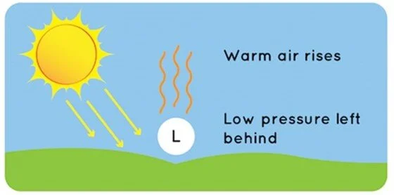
Exhibit 7. How Wind Is Created SOURCE: NOAA
Gases behave differently at different temperatures. This is what contributes to wind. Gases move from high-pressure areas (cooler air) to low-pressure areas (warmer air). The greater the difference between the pressures, the faster the air moves from high to low pressure pockets, and that rush of air is our wind. Why does the air move between the two pressure centers? It is a phenomenon of nature where things try to always even out, a term called diffusion.

Exhibit 8. Wind Speed Caused By Air Rushing To Fill Low Pressure SOURCE: NOAA
Another natural phenomenon explains why wind doesn’t blow in a straight line. The Coriolis effect is the deflection of all moving particles of matter at the Earth’s surface to the right (counterclockwise) in the Northern Hemisphere and to the left (clockwise) in the Southern Hemisphere. The movement in the respective hemispheres is related to the Earth’s rotation. Since wind is not attached to the Earth, it doesn’t move along with the Earth’s rotation. It curves when it blows from a high pressure to a low-pressure area.
When a low-pressure area is extensive, the wind’s curvature pattern can deflect it well away from the covered area. This is what happens when large low-pressure systems settle over areas as large as the European continent or the Pacific Northwest. That is why the wind didn’t blow in these regions earlier this year.
Before going further into the wind frequency issue, it is appropriate to understand the structure of the U.K.’s power sector and the role of renewables, especially wind. We begin with a review of the nation’s electricity generation capacity from 1996 to 2019 (latest data available), as reported by the U.K. Department of Business, Energy & Industrial Strategy (BEIS) in its 2020 report. The chart below shows renewables contributing a small portion of U.K. electricity generation until about a decade ago when its share of capacity took off and climbed rapidly to where it is today.

Exhibit 9. U.K. Electricity Generating Capacity By Fuel History SOURCE: BEIS
The next chart shows the make-up of the U.K. renewables sector. It shows wind and marine accounting for 23% of the total, second behind biomass with a 66% share. The table below the chart shows all the categories that make up biomass. Hydro (2%), solar PV (5%) including geothermal, and heat pumps (4%) make-up the balance of renewables.

Exhibit 10. U.K. Renewable Energy Portfolio Composition SOURCE: BEIS
A chart from the International Renewable Energy Agency (IRENA) shows the installed capacity of onshore and offshore wind in the U.K. for 2010-2020. The chart shows that onshore wind capacity has remained stable for the past three years, while offshore wind capacity has grown.

Exhibit 11. U.K. Installed Wind Capacity By Location SOURCE: IRENA
The most telling chart is below, showing the amount of energy generated from renewable energy sources for 2000-2019. What is striking is the collective (onshore and offshore) amount of wind energy generated in recent years. The chart indirectly shows that the U.K. experienced more wind output during 2017-2019, although the earlier chart showed stable onshore generating capacity. The growth in offshore wind’s contribution reflected both increased capacity and more wind.

Exhibit 12. U.K. Renewable Energy By Source SOURCE: BEIS
To appreciate the extent of the stillness experienced in the United Kingdom, data collected by our-energy-future.com, a thought group in the U.K. that says its mission is “to challenge the current UK approach to electricity supply into the future,” shows the wind lulls through August for both 2020 and 2021. Their chart below shows the total hours monthly when wind’s contribution fell below 5%, as well as the number and hours of wind lulls exceeding five- and ten-hour durations, along with the maximum number of lull-hours. The data shows that total hours of below a 5% contribution nearly doubled between 2020 and 2021. The remainder of the data confirms the greater stillness so far this year than in 2020.

Exhibit 13. The Stillness Of U.K. Wind 2020 and 2021 SOURCE: our-energy-future.com
A review of the lulls for all of 2020 shows that the final four months of that year added an additional 30% to that year’s total hours of wind lulls below 5% of U.K. power. During these final months, there were 55% more lulls in total, 45% more lulls of over five hours duration, and 47% more lulls extending beyond 10 hours. If the number of lulls and hours with low wind power seen in the final four months of 2020 are matched this year, 2021 totals will reflect 1,332 total hours of lulls, 124 lulls, 58 lulls of more than five hours duration, and 38 with lulls longer than 10 hours. Such an outcome would continue the power challenge facing U.K. electricity deliverability.

Exhibit 14. What Did Wind Lulls Look Like In 2020? SOURCE: our-energy-future.com
In thinking about the increase in lulls, much like those of blackouts that have also increased in recent years, we wondered whether 2021 was indicating a future trend. We read numerous research papers including one from DNV, a European firm involved in assurance and risk management. Their paper showed an analysis of the UK’s 2020 windiness. The charts below show the windiness performance monthly. DNV called 2020 a normal year, although they acknowledged that there often can be monthly extremes that during the year saw a +40% premium to a -6% underperformance. The second chart shows 2019 and 2020 monthly windiness data seasonally adjusted.

Exhibit 15. The U.K. Monthly Wind Index In 2019 and 2020 SOURCE: DNV
Another set of charts from the DNV article highlighted the monthly UK wind index and the seasonally adjusted index. The second chart shows the same data series but on a quarterly basis. For all of 2020, the UK wind index was up 6% last year. In the quarterly chart we see that 2020’s wind was stronger in the first and fourth quarters but underperformed during the second and third quarters.

Exhibit 16. How U.K. Wind Index Stacked Up Against Historical Average SOURCE: DNV
The final DNV chart shows the long-term UK wind index. Over the 24 years, we notice that there are years when wind outperforms, just as there are years when it underperforms. There are multiple year spans when wind is a better or worse performer, but there does not appear to be a long-term sustained trend in either direction.

Exhibit 17. The Long-Term Performance Of U.K. Wind Index SOURCE: DNV
Although the performance of U.K. wind in 2020 and 2019 was interesting, the long-term performance record fit well with another paper we read. That paper, “Long-Term Wind Speed Trends In Northwestern Europe,” was written by three people affiliated with U.K.-headquartered Garrad Hassan and Partners Ltd., a renewable energy consulting firm. Their paper was written in 2009 and updated, extended, and expanded on research the authors had previously published in 2006.
The paper presented a chart showing a series of windiness indices for Northwest Europe from 1990 to 2008. All the indices mirrored each other’s performance suggesting that the data was reflective of most of Europe and the U.K. What is evident is the variability in annual wind performance. But from 1990 to 2003, there was a clear downward trend in wind performance. Post-2003, the trend reversed and climbed to 2008, the end of chart’s data.

Exhibit 18. How Wind Indices For Northern Europe Performed SOURCE: Garrad Hassan and Partners Ltd.
The purpose of this paper was to investigate whether there were other indices with longer histories that could be used to assess windiness trends prior to 1990. This quest has the authors exploring various data sets before settling on the three they concluded possessed the best fit. The next chart shows how these three indices compared with the average of the windiness indices for the 1990-2008 period. The authors showed that all the traditional statistical tests confirmed the fit of these three indices with the average of the windiness indices.

Exhibit 19. Substantiating Wind Speed Proxies Against Windiness Indices SOURCE: Garrad Hassan and Partners Ltd.
The authors’ three proxies were chosen to reflect conditions in northwestern Europe, northern Europe, and the British Isles. One proxy was the North Atlantic Oscillation (NAO) index, which plays an important role in meteorology. The Jenkinson Lamb index is a widely used daily large-scale weather classification rating for the British Isles. The Katalog der Grosswetterlagen Europas, which translates as “catalogue of large-scale weather patterns in Europe”, is a system to collect and classify large-scale weather patterns over Europe based on a subjective analysis of meteorological charts.
These proxies extended back to 1965. As the chart below shows, the individual indices annually exhibited significant variability, not unlike the U.K. wind index. By employing a 5-year moving average, we can see general trends for the indices. What stands out is that these indices were stable from 1965 through the late 1980s, before rising and remaining high in the early 1990s. From 1990 forward, the pattern of these three proxies mirrors the trends of the average of the Northern European wind indices – very high in the early 1990s, falling steadily until the mid-2000s, and then climbing to 2008.

Exhibit 20. Proxy Indices Show Possible L-T Issue For Wind Speed SOURCE: Garrad Hassan and Partners Ltd.
The authors of the paper drew this key conclusion from their research.
The downward trend observed in the windiness indices for the period 1990 to 2005 is also reflected in the North Atlantic Oscillation, Grosswetterlagen and Jenkinson Lamb data. However, these proxies for wind speed indicate that there was an upward ‘blip’ in wind speeds centered on the early 1990s, which suggests that this recent downward trend in mean annual wind speed may represent a return to the longer-term mean. It is therefore concluded that a continued ramp down of future wind speeds should not be assumed. This is also supported by the increase in annual wind speeds in recent years as displayed in Figure 1 (our Exhibit 18, page 20).
It is important to note that this paper was published at a time when there were concerns about a continuation of the declining wind performance, especially as European governments were pushing utilities to embark on a massive buildout of wind generating capacity. The authors offer the conclusion that the post-2003 wind performance was a return to the long-term average wind speed and an end to the relentless decline of prior years. The conclusion we draw, however, is that even if Europe’s wind speed returns to its long-term average, the continent may experience future periods of wind speed resembling the 1990-2003 span when it was in a broad downward trend. That potential, something we have not heard discussed during the wind generation buildout in recent years, suggests wind energy dependency may put utilities at greater risk of stillness than considered in their planning.
The more that European countries come to depend on wind power for running their economies, the possibility of extended wind speed declines and increases in lulls means utilities will be scrambling more often to find backup power. Will they rely on huge batteries, or more fossil-fuel plants? Does this potential stillness risk increase the pressure on governments to allow utilities to keep their nuclear power plants operating, or even to begin building new ones? These are questions politicians and the public need to consider and answer, so energy planners can move forward. We have yet to see discussion of stillness as a potential long-term cyclical challenge for wind power, and in turn, Europe’s electricity grid. Maybe it is time for that discussion to begin.
Which Is The Next Coal Mine Canary – Europe Or China?
The energy crisis first emerged in Europe and is now sweeping across the world. As we watched the power problems of Germany and the U.K. this spring and summer due to the absence of wind energy, few people expected an energy crisis to emerge in Asia, especially in China. The energy crisis was kicked off by the underperformance of renewable energy in Europe to deliver the anticipated volumes, forcing utilities to scramble for backup power supplies.
Besides the poor performance of renewable fuels, other contributing factors included: the continuing fallout from the colder-than-normal winter of 2020-2021 that depleted gas storage volumes across the Northern Hemisphere; tightness in the global natural gas supply that sent LNG prices soaring; the premature closing of nuclear, coal and natural gas power plants reducing dispatchable power; and limited supplies of coal. These problems arose as global economic activity rebounded from the pandemic-depressed 2020 and drove up energy demand. Against this mosaic of energy challenges is the fallout from social and geopolitical trends driven by fears over climate change that pressured investors and financiers to limit funding for fossil fuel activities.
News stories abound about the challenges facing the global gas industry and its spiking prices. Now, the global coal industry is struggling to meet exploding demand driven by utilities switching from expensive gas to cheaper coal to limit electricity price increases.
The rush to refill gas storage in Europe, North America, Russia, and Asia ahead of the upcoming winter, in the face of tight global gas supply, has caused gas prices to soar. Natural gas prices in Europe are in the high $20s per thousand cubic feet (Mcf), and recently touched $40/Mcf in Asia. Similarly, U.S. gas prices breeched the $6/Mcf barrier, the highest price since 2008. The huge price disparity between U.S. gas prices and those in Europe and Asia has created significant arbitrage opportunities for U.S. LNG shippers. Their shipments are at record levels, which can only grow in 2023 when new LNG export capacity begins operating.
In the U.S., the prevailing view is that the European energy crisis is a preview of our future if we continue down the same road to rely on renewable energy to power our electricity system, while dismantling our fossil fuel generating capacity. Based on current and prospective government energy policies, this will become a reality. Maybe planners working on restructuring the U.S. electricity industry, as well as our overall energy system, should pay attention to long-term trends beginning to impact Europe and China and that will alter their future energy needs. These trends may point out potential issues U.S. energy planners should be thinking about.
A recent article by Leon Kolankiewicz, an environmental scientist, and Scientific Director of NumbersUSA, published on issuesinsight.com, is worth considering. The article was titled “Science Says: We Can’t Grow The Population And Cut Carbon Emissions At The Same Time.” The gist of the article is that the Biden administration’s push to reduce carbon emissions by at least 50% below 2005 levels by 2030 and achieve zero net emissions by 2050 while at the same time encouraging immigration through policies such as raising legal immigration limits, granting citizenship to undocumented residents, granting asylum eligibility via an executive order, and failing to secure our southern border cannot coexist. As Kolankiewicz wrote:
The problem is, more people lead to more energy consumption, which means more greenhouse gas emissions. Since 1990, U.S. carbon emissions per capita have declined by 15% thanks to concerted efforts by governments, companies, and individuals to cut back. Yet over the same time period, total U.S. carbon emissions have increased by about 2%.
The author’s conclusion is that new immigrants expand their carbon footprint as soon as they land in the U.S., which he considers bad news for the planet. In his view, we should shut our borders and ban new immigrants in the name of climate change. He chastises the Biden administration for the irrationality of its climate change and immigration stances.
Kolankiewicz says the Biden officials should review the 1996 findings of President Bill Clinton’s Population and Consumption Task Force. The Task Force was established by the President’s Council on Sustainable Development inspired by the 1992 U.N. Earth Summit in Rio de Janeiro, which popularized the idea of sustainable development.
Sustainable development is defined as meeting the needs of the present without compromising the ability of future generations to meet their own needs. Given its focus, the Task Force concluded that “the size of our population and the scale of our consumption are essential determinants of whether or not the United States will be able to achieve sustainability.” It acknowledged that “This is a sensitive issue but reducing immigration levels is a necessary part of population stabilization and the drive toward sustainability.” Kolankiewicz is disappointed that the Biden administration has not embraced the Task Force’s recommendations, which would stop America’s population from growing, something it did on average by 27 million people per decade since the 1990s, largely due to immigration, as our fertility rate is slightly below replacement level.
We wonder what the global reaction would be if the U.S. embraced Kolankiewicz’s view? First, it would go against our moral compass. The U.S., built by immigrants, has always welcomed those seeking greater opportunities. Such a policy likely would sink the climate change initiative since no one could come to America, so immigrants confined to their home countries would demand to be able to achieve higher living standards causing a rapid increase in their energy consumption and carbon emissions.
Even without such a restrictive U.S. immigration policy, the populations of developing economies will grow necessitating more financial and technological aid to boost living standards, which begins with providing all citizens with access to electricity. According to the International Energy Agency (IEA), in 2020, roughly 10% of the world’s population, or 771 million people, lacked access to electricity. Three-quarters of the deprived reside in Africa, with another 20% in Asia, primarily Southeast Asian countries. The balance of the population lacking access to electricity is scattered throughout the Middle East and South America. Getting these people electricity would eliminate them having to cook and heat with dung, wood, and other biofuels that cause indoor pollution and contribute to early deaths.
Another aspect of adopting Kolankiewicz’s policy would be its demographic impact. For the U.S., we would go from a slowly growing but aging population to a declining and more rapidly aging population. Such a policy would hurt U.S. economic growth. Likewise, at the same time undeveloped economies experienced rising living standards, albeit from low levels, America’s living standards would be eroding. What U.S. politician wants to preside over that era of America’s history?
Taking off from Kolankiewicz’s article, we think it would behoove energy planners to consider trends in population and economic growth that are well advanced in Europe and China. While the U.S. population currently is better positioned than either Europe or China, what we do about immigration will impact our future population makeup with implications for carbon emissions and economic growth.
What can we learn from studying Europe or China that will provide insight into the future of the U.S.? We begin with examining the economic performance of China, the European Union, the U.S., and the world as measured by their annual growth in Gross Domestic Production, as reported by the World Bank. The chart below is not surprising, as we have known of China’s high annual GDP growth (explained later), although there are many questions about its accuracy. However, we know China’s growth was driven by it becoming a manufacturing powerhouse due to cheap labor. That labor pool grew as rural workers migrated to urban centers to secure jobs paying better than farming.
What this chart also shows is how closely annual GDP growth was between the world, the European Union, and the U.S. As the latter two represent most of the major industrialized and developed economies of the world, their growth rates largely drive the world average. What is also evident is that GDP growth in the earlier years was higher than in recent times. In particular, the growth over the last decade has been slower than in earlier periods, raising questions about whether economies are still struggling to recover from the financial crisis of 2008, or whether there are structural problems with economies that will limit future growth.

Exhibit 21. The Story Of Global Economic Growth SOURCE: World Bank, PPHB
A recent article in Strategic Intelligence focused on demographic investing. Author Jim Rickards outlined the issue behind declining births, which is basically people deciding to have fewer babies and why they make such a decision. The natural population replacement rate is 2.1 children per couple on average, a rate necessary to keep a nation’s population stable. He went on to explain how the replacement rate, known as the fertility rate, impacts GDP.
Most of us are familiar with the economic definition of GDP, which is C + I + G + (X - M) = GDP. In this formula, C is consumption, I is investment, G is government spending, and (X – M) is exports minus imports. All these categories add up to GDP.
A simpler way to look at GDP is the formula: L * h = GDP. L is labor productivity, while h is the total hours worked. We merely need to know how many hours were worked and how productive each hour worked was to calculate GDP. This formula provides an easier way to assess the impact of demographics on GDP. If a population is shrinking and aging at the same time, then fewer hours will be worked, and an aging population means more hours devoted to caring for the elderly, which are less productive hours worked. This translates into slower growth in GDP and ultimately a declining GDP. There have been two times in our history when these conditions contributed to sustained declines in GDP – the Thirty Years War (1616-1648) and The Black Death (1350s).
What is driving the demographic decline? There are three major drivers: urbanization, education, and women’s emancipation. Urbanization’s impact has come from the migration of poor rural workers to cities where they can find work in assembly-style manufacturing and affordable housing. While the work and living conditions might not be ideal, they represent an improvement over the lifestyle the rural worker was experiencing earlier and certainly his productivity is greater.
Education comes with greater job opportunities and improved knowledge about contraception, family planning, and women’s health issues, which contribute to smaller families. Lastly, women’s emancipation from religious, patriarchal, and traditional roles and expectations gives women more opportunities to shape their own and their family’s choices.
The demographic problem shows up in the low replacement rate in developed economies. The chart below demonstrates how many major economies, regions, and organizations of countries have low replacement rates.

Exhibit 22. Birth Rates In Many Countries Below Replacement SOURCE: Strategic Intelligence
What is more troubling is the declining replacement rates in developing economies.

Exhibit 23. Even Developing Economies See Lower Birth Rates SOURCE: Strategic Intelligence
What is most concerning to Rickards is the demographic trends for China and India. According to U.N. population statistics and projections, China has a population of 1.44 billion people, some 60 million more than India’s 1.38 billion. Together, these two countries account for 36% of the world’s population. The chart below shows the history of fertility rates for China and India.

Exhibit 24. How India and China Populations Have Evolved SOURCE: Strategic Intelligence
With China’s fertility rate below the natural replacement rate, and India’s rate not materially above it, the long-term trends are ominous. The following two charts show what might happen to the populations of the two countries by 2100.

Exhibit 25. How India And China Populations Will Change SOURCE: Strategic Intelligence
What we see in these charts is that the Chinese and Indian populations reach similar size in 2026, after which China’s population growth begins trailing that of India’s, assuming continuation of each country’s fertility rate. China’s population peaks in 2035 and then declines by 400 million by 2100, returning to what it was in 1985. India’s population continues growing until 2060. Over the next 40 years, India’s population shrinks by 200 million people, putting it in 2100 back where it was in 2025.
Although Rickards acknowledges that the demographic trends will take 30-50 years to play out, these trends are now emerging and will shape investment opportunities in various countries, with implications for energy demand. He lists the biggest loser as China (more later) and the biggest winners the U.S., Canada, Nigeria, and India. He sees Latin America also underperforming, but not as badly as China. The European Union and Japan will “muddle” through, in his estimation. This is because they are rich societies despite experiencing slow growth and facing economic headwinds. Rickards echoed a statement made by others that “China will become old before it becomes rich.”
One might wonder whether China’s Xi Jinping, President of the People's Republic of China, and the General Secretary of the Chinese Communist Party, is driving his country’s economic and political strategies with the intention of becoming richer and more powerful quicker in anticipation of the future China due to current demographic trends. Not only do demographic trends possess significant implications for China’s economy, its government, and society, Xi’s moves will also reverberate throughout the world’s economy. Moreover, these trends warrant a reappraisal of long-term population trends and their impact on economic growth, energy demand, and climate change predictions.
A paper authored by Louis-Vincent Gave of Gavekal Research, examined China’s investibility in a question-and-answer format. The paper was prompted by the current focus on Chinese real estate firm Evergrande ‒ its potential collapse and the implications for investors, financial markets, and China’s economic and geopolitical strategy. Gave asked and answered numerous questions including:
Is Evergrande China’s Lehman moment?
But don’t you find this string of corporate takedowns scary?
Surely China and the west can work together on some issues?
Doesn’t that mean China’s growth will slow further?
Won’t slower growth threaten Xi’s grip on power?
But right now, isn’t Evergrande a major deflationary shock?
Gave made key points about how China’s economy and political policies have changed under Xi’s leadership and what it means for the future of China-U.S. relations. In his opinion, the worst experience for Xi, which has prompted many of the economic policy changes, related to his “impotently” watching the U.S. government crippling the business of Huawei, the Chinese telecommunications and consumer electronics company, seen as a key player and beneficiary of the global shift to 5G communications. This experience convinced Xi that China needed to address its three main vulnerabilities: dependence on imported semiconductors, foreign energy, and the U.S. dollar.
In the case of semiconductors, China spends more per month on importing them than it does on importing crude oil. The ongoing crackdown on Chinese video games and developers is designed to pressure them to shift to developing state-of-the-art semiconductor technology to rival Taiwan Semiconductor Manufacturing Company, currently the world’s leader. Has this shift also contributed to the increased military tension over the ‘One China’ policy and the repeated threats against Taiwan?
With respect to energy, China imports 10 million barrels per day of crude oil, along with loads of coal and LNG via seaborne routes.This vulnerability has prompted China to step up its naval fleet expansion and its development of islands in the Southeast Asia region to support its military in protecting the sea lanes the country depends on.
Additionally, China has stepped up the construction of pipelines from the port of Gwadar in Pakistan, from Russia, and from Kazakhstan. Importing more oil and gas overland helps reduce China’s vulnerability to seaborne trade.
The dependence on the U.S. dollar is pushing China to try and transform its currency, the renminbi, into a credible trade and reserve currency. The value of the renminbi has been strong over the past three, five and 10 years. Even with all of China’s current economic and geopolitical headwinds, its bond market has proven solid, despite turmoil in its equity market, and the renminbi has remained strong. These financial dynamics have encouraged China to move away from its policy of massive bailouts of overleveraged and financially stressed property developers in favor of a new policy of taking the pain up-front and letting these overstretched companies go bankrupt to convince others to get their financial houses in order.
Interestingly, in response to the question of China and the U.S. working together, climate may be one area where they can cooperate, despite recent tensions. Those tensions might provide China leverage in negotiations over adjustments to its “peak carbon 2030” commitment, as well as the 2060 timing for becoming a net neutral economy. Remember, China is the world’s worst polluter, and likely to remain such for many years, so an agreement to cut emissions somewhat might get it room in other policy areas. But the bigger question is what becomes of China as the world’s largest supplier of steel, aluminum, petrochemicals, shipbuilding, and other energy-intensive products in a peak carbon 2030 world? The real advantage China possessed in these industries was its willingness to accept more pollution to sustain them. If it is no longer willing or able to play this role, China’s growth will slow, but where will the world turn for cheap excess materials? And what may that mean for global inflation?
With respect to the question of the impact of slower growth on Xi’s power, Gave believes many people have misread Chinese history. Since the Communist Party is not legitimized by elections, the common belief outside of the country is that the Party derives its power from delivering rapid economic growth with the benefits of jobs, rising incomes, and improved living standards. Realistically, the Party is legitimized by delivering social stability. As Gave wrote:
Between the start of the Taiping Rebellion in 1850 and the end of the Cultural Revolution in 1976, China knew little but famine, civil war, foreign invasions and hyperinflation.
For generations China was among the hardest places in the world to live, which explains why so many Chinese left to work as quasi-slaves building railroads in the US or Canada, or working in plantations across South East Asia. It also explains why, when in 1998-99 China launched a tough restructuring of its state-owned enterprises, shedding more than 30mn industrial workers, social tensions never threatened the regime.
This discussion led Gave to point out a largely overlooked development last year, which was the release of China’s latest census. It showed the population aging faster due to lower birthrates than previously thought. Also, the country is urbanizing faster than expected. According to Gave, a decade ago, 15-20 million Chinese left rural areas each year seeking work in urban areas. The old rule of thumb was that 8% annual growth delivered 20 million new jobs, which explains the old target of 8% annual GDP growth. Now the Chinese work force is shrinking and will continue to, as shown in chart below.

Exhibit 26. China’s Shrinking Workforce Is Ominous For World Economy SOURCE: Gavekal Research
The chart is ominous for the Chinese and world economies. First, fewer workers mean slower growth for China’s economy. Second, China’s government will no longer need to push for growth-at-all-costs, since there is little need to create new jobs. Third, with workers becoming scarce rather than plentiful, China will be less of a deflationary force for the world’s economy. These trends will have long-term impacts on the functioning of the world’s economy. Furthermore, China’s economy will be shaped by the government abandoning its too-big-to-fail business model, shown by how it addresses Evergrande.
The too-big-to-fail business model worked during the last decade when creating 15-20 million jobs each year was paramount, allowing, and even encouraging, overinvestment by companies. With creating jobs no longer a priority, the government may not tolerate excessive capital investment. In Gave’s opinion these are the issues the world should be contemplating.
What should the world make of a China that invests less, where companies are incentivized to stay below the radar rather than to grow rapidly by adding excess capacity, and where labor, instead of being abundant, now becomes scarce? All this points towards a macro shift away from the “age of plenty” to “an age of scarcity”.
If you are inclined to doubt all this, take a look at the chart below, which is probably the scariest in China today. At a time when China is attempting to crack down on carbon emissions, when Chinese economic growth is visibly slowing, when the Chinese real estate sector is hitting the skids, why has the price of coal in China surged to an eight-year high? If Evergrande is such a deflationary shock, why is this happening?

Exhibit 27. How Long Will Inflation Be A Problem? SOURCE: Gavekal Research
While the above chart of high coal prices in China is not likely to last – if you believe in the economic principle that high prices bring forth more supplies or reduce demand leading to lower prices. Similar price charts exist in Europe for natural gas and coal. Again, these high prices will come down at some point. What cannot be ignored, however, are the fundamental trends at work everywhere that will leave us in a more inflationary world. That means even renewable energy will cost more since solar panels and wind turbines will be made from more expensive materials, not just now or during this winter, but in the long-term unless, and until, we get a surge in investment throughout the energy matrix bringing down prices. More people and rising living standards mean primary energy demand will grow. It cannot be met by renewables alone.
Which canary – Europe or China – should we be watching? While Europe would seem to be a more important indicator in the battle between renewables and fossil fuel power, China’s issues may have greater significance for the U.S. 10-20 years in the future.
China is rushing to become the world’s largest economy, overtaking the U.S., while also flexing its geopolitical muscle, especially in Asia, a region that recent U.S. presidents have largely ignored. A bigger problem for the U.S. economy may be if China yields its role as the world’s manufacturer with its cheap energy and labor. Not only will China’s economy be slowing due to its demographic issues, but the world’s economy will slow, also. Slowing economic growth will create new and unanticipated challenges. The one economic strength China is unlikely to yield is its dominance in the rare earth minerals business and green energy products. This is a significant vulnerability for the U.S. as it continues rushing towards a net zero emissions world. Policymakers must address this issue soon if they hope to avoid an energy transition disaster. But as Europe shows, it may be too late to avoid such a disaster.
Leveraging deep industry knowledge and experience, since its formation in 2003, PPHB has advised on more than 150 transactions exceeding $10 Billion in total value. PPHB advises in mergers & acquisitions, both sell-side and buy-side, raises institutional private equity and debt and offers debt and restructuring advisory services. The firm provides clients with proven investment banking partners, committed to the industry, and committed to success.
